Envision
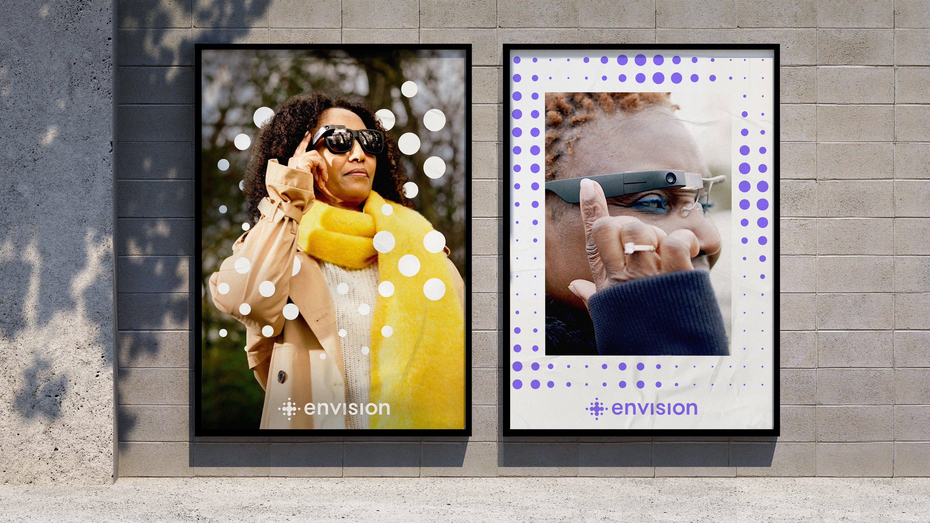
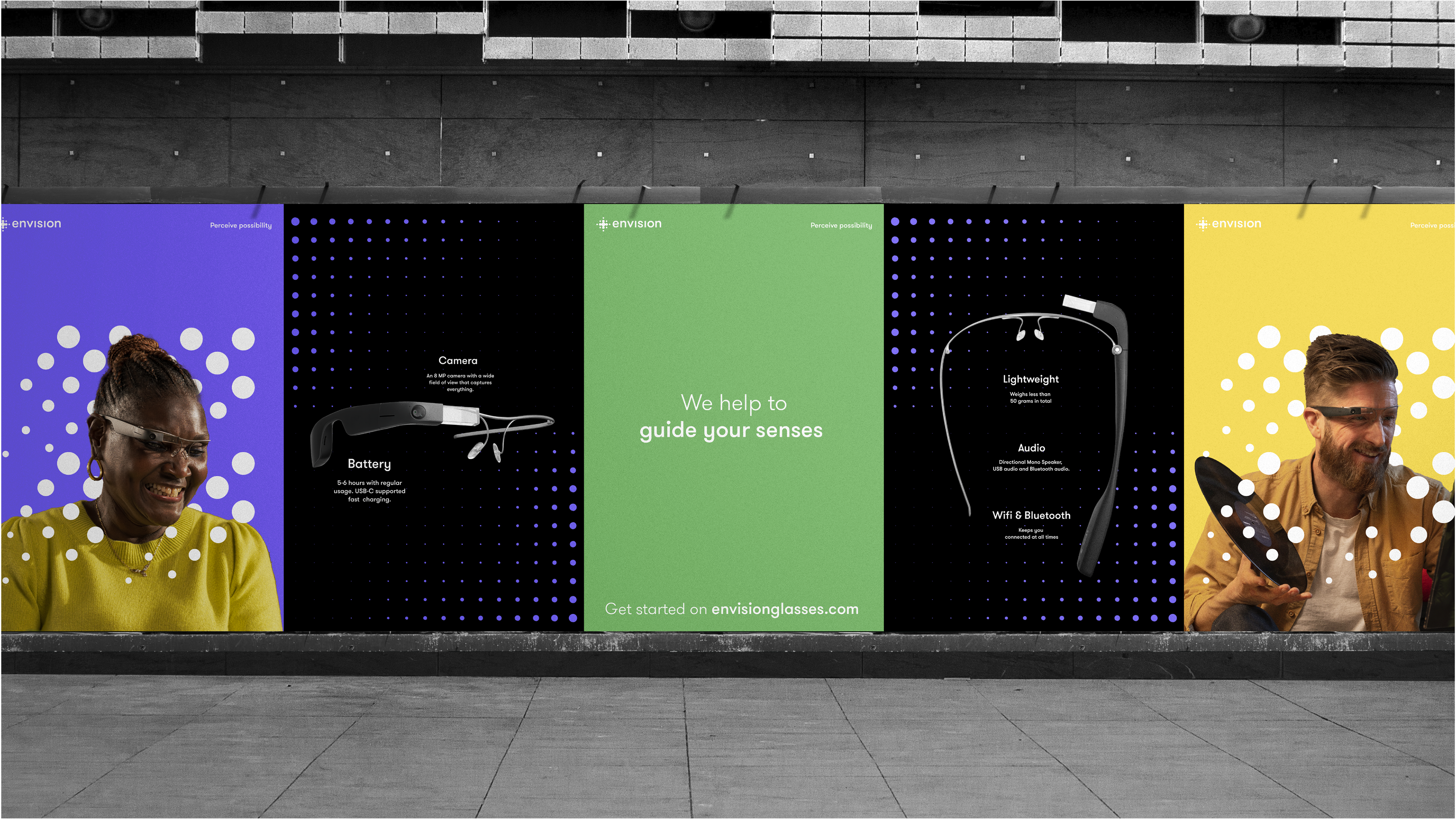
Envision helps to build vital independence for visually impaired people and supports them throughout every little daily action by articulating the world around them. The brand had to speak both to users - either partially or totally visually impaired people - and to their caregivers.
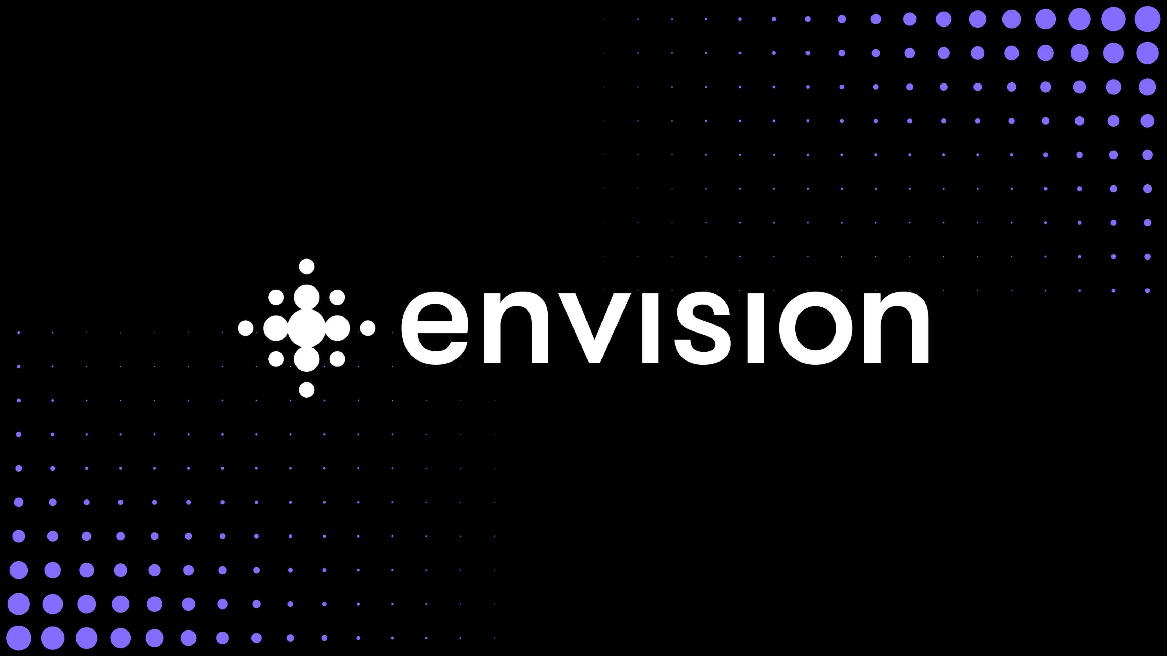
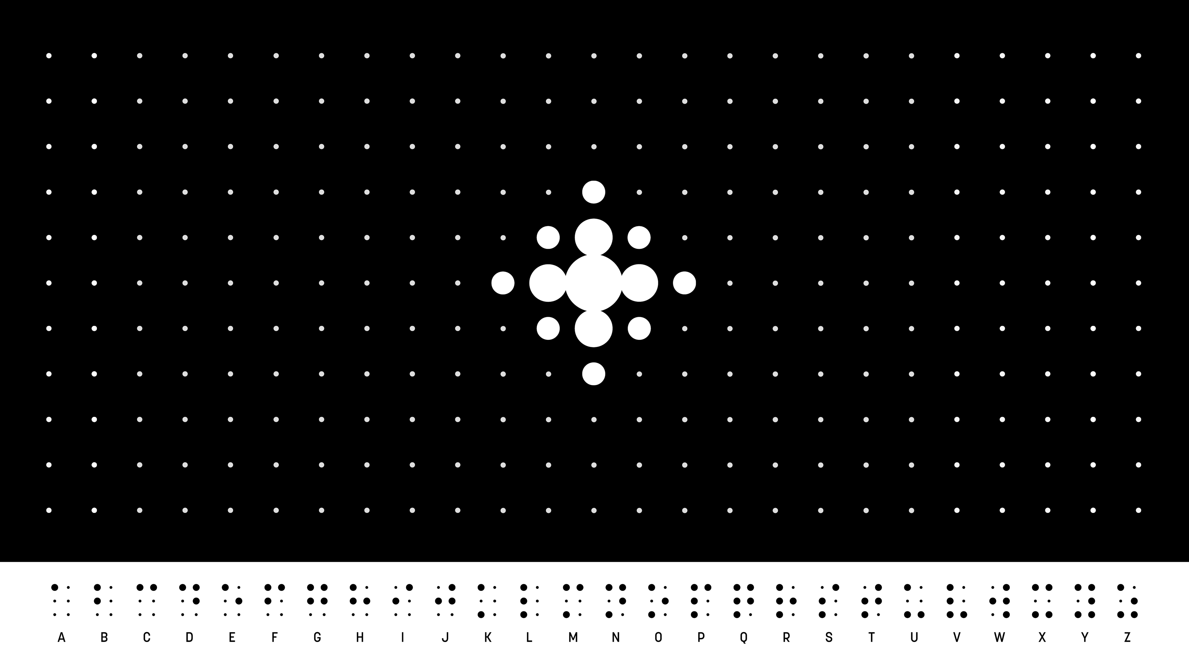
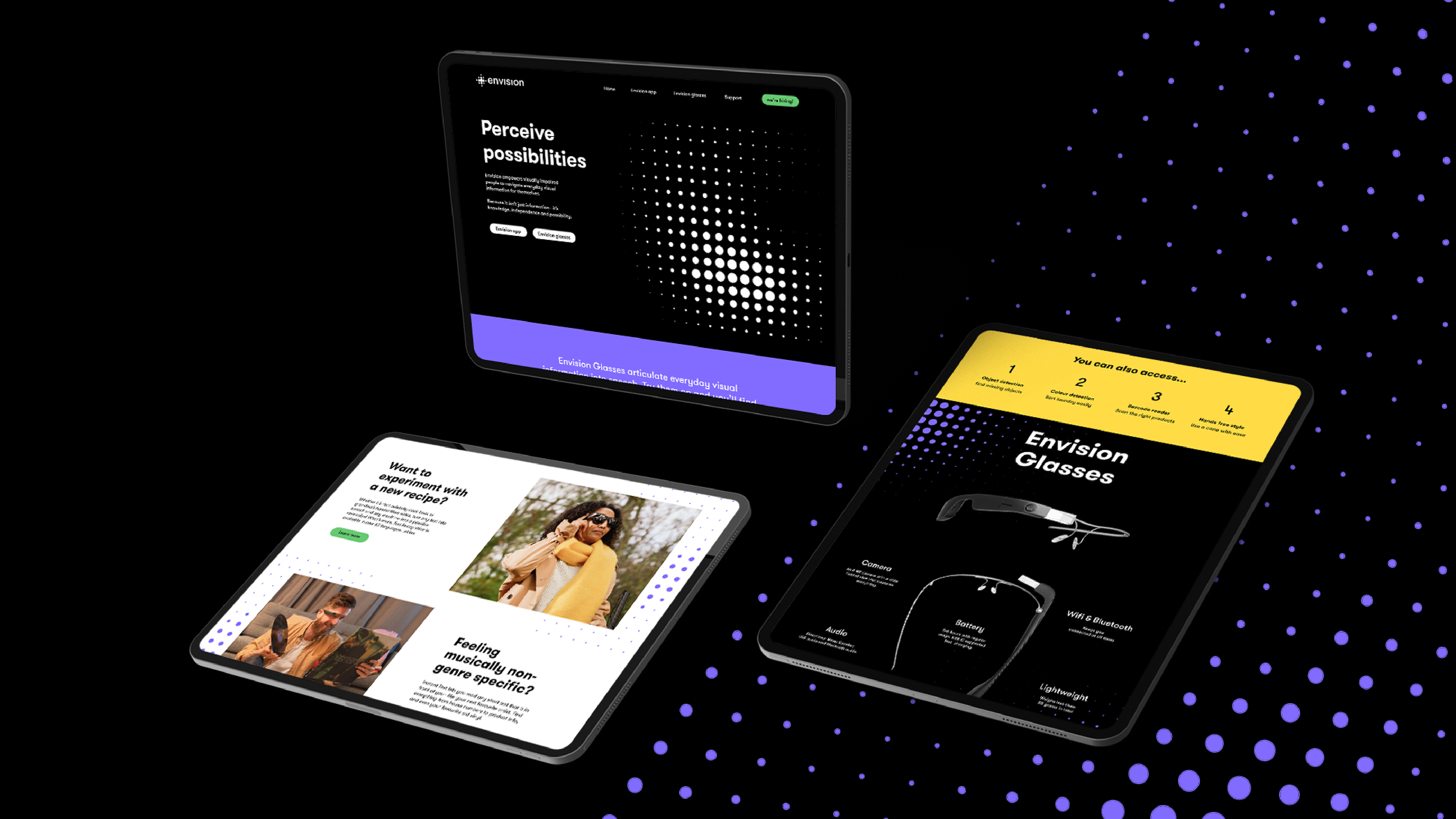
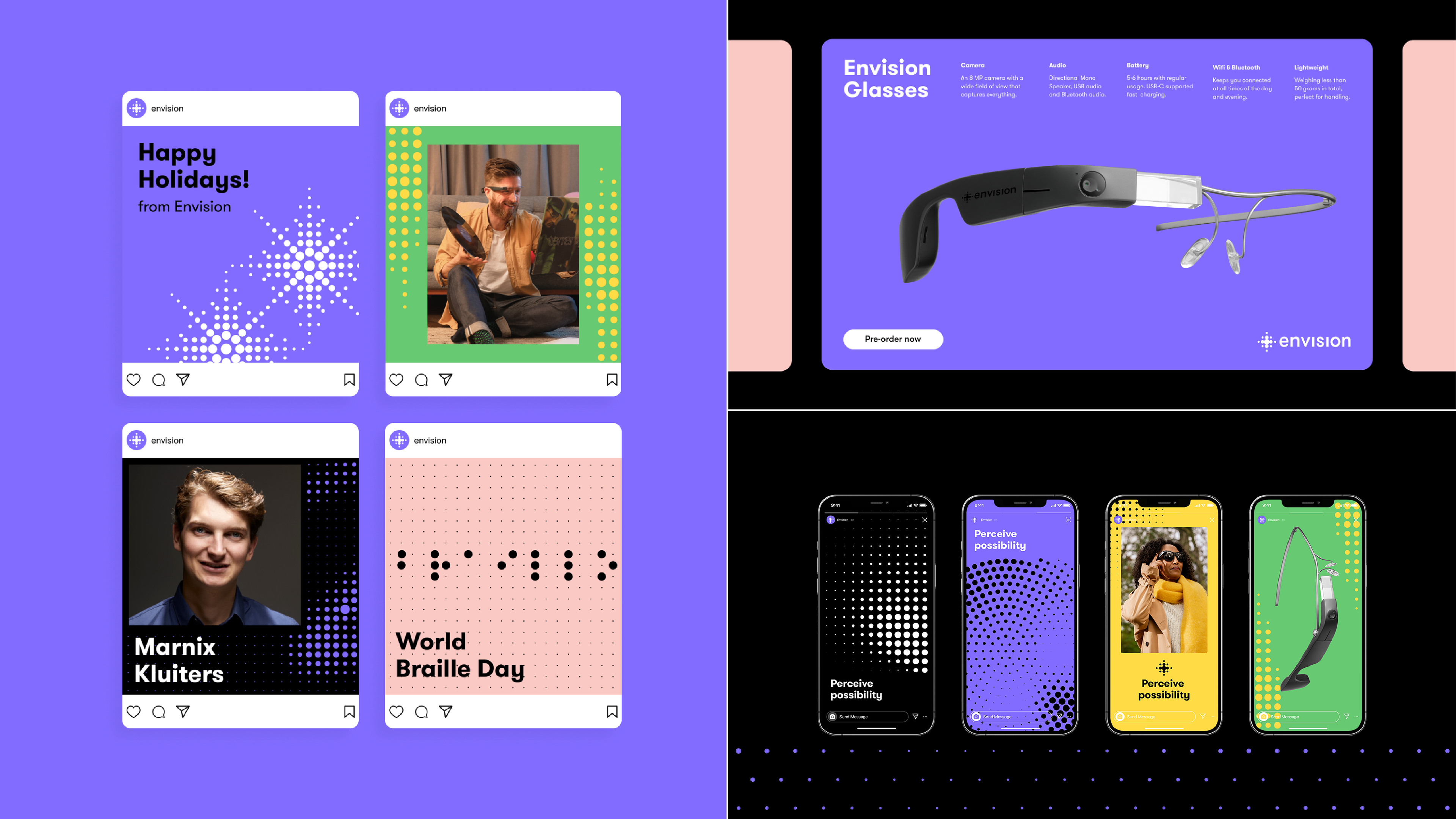
The redesign therefore takes inspiration from the familiar, departing from the Braille alphabet, but applies it in a way that showcases Envisions more straightforward properties to empower and bridge the accustomed with the advanced.
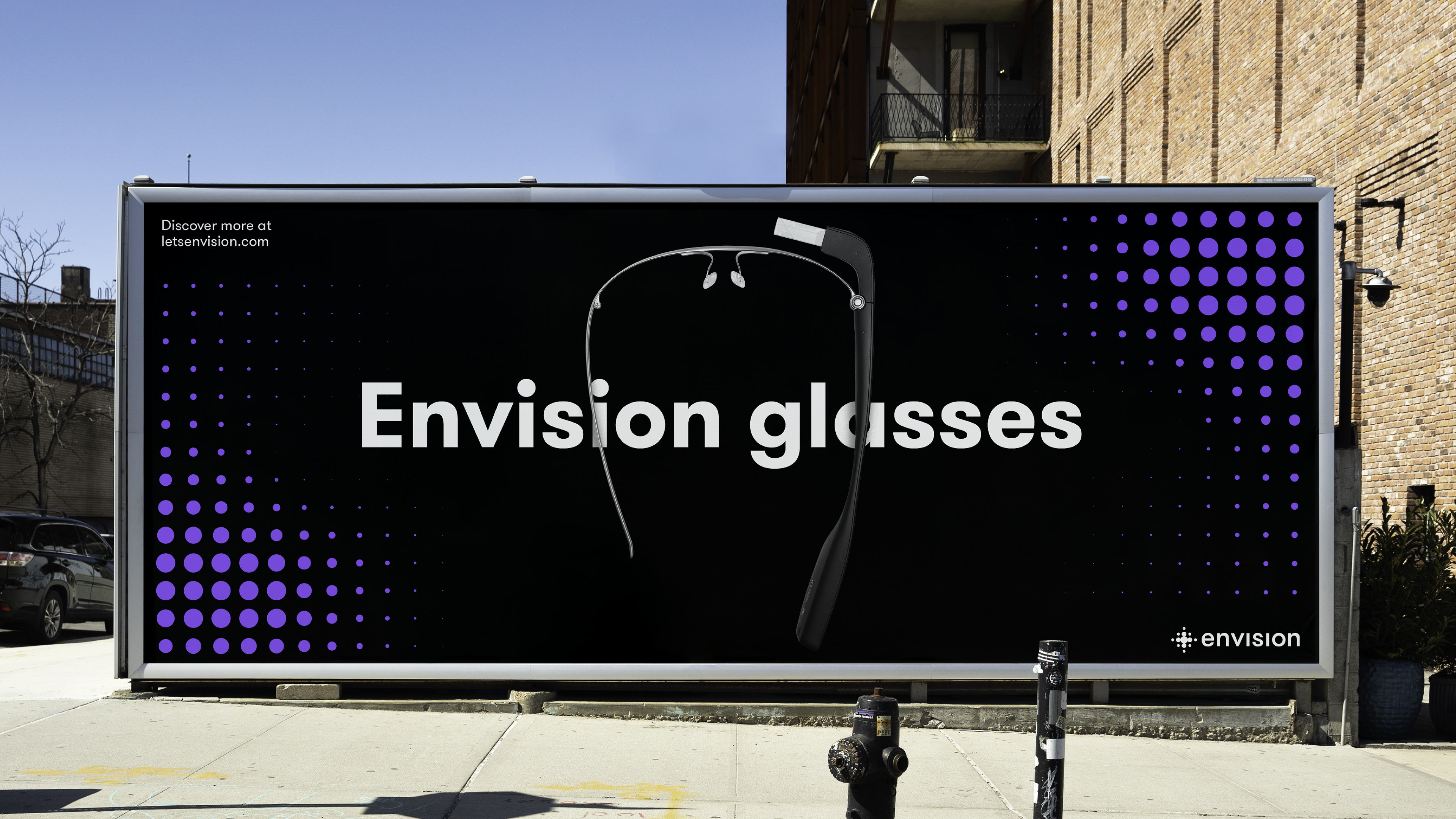
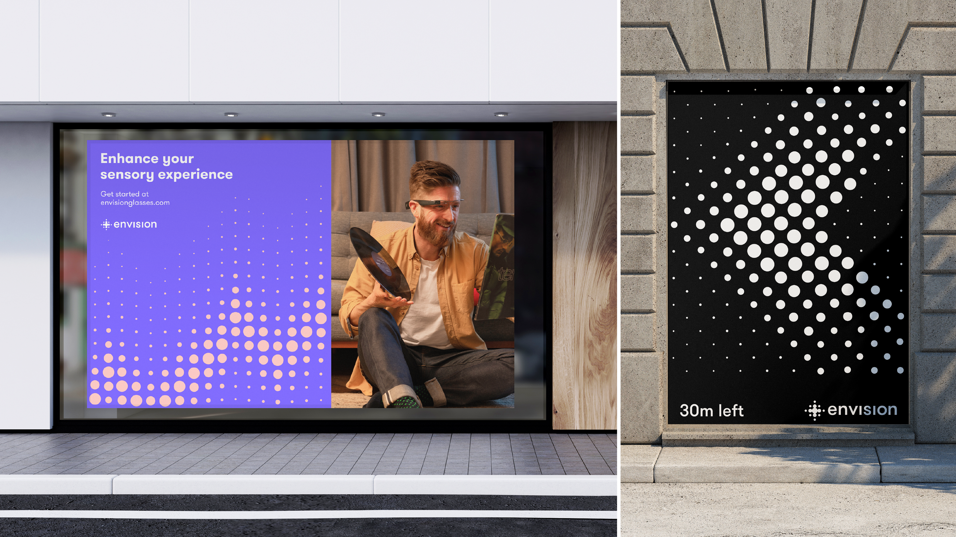
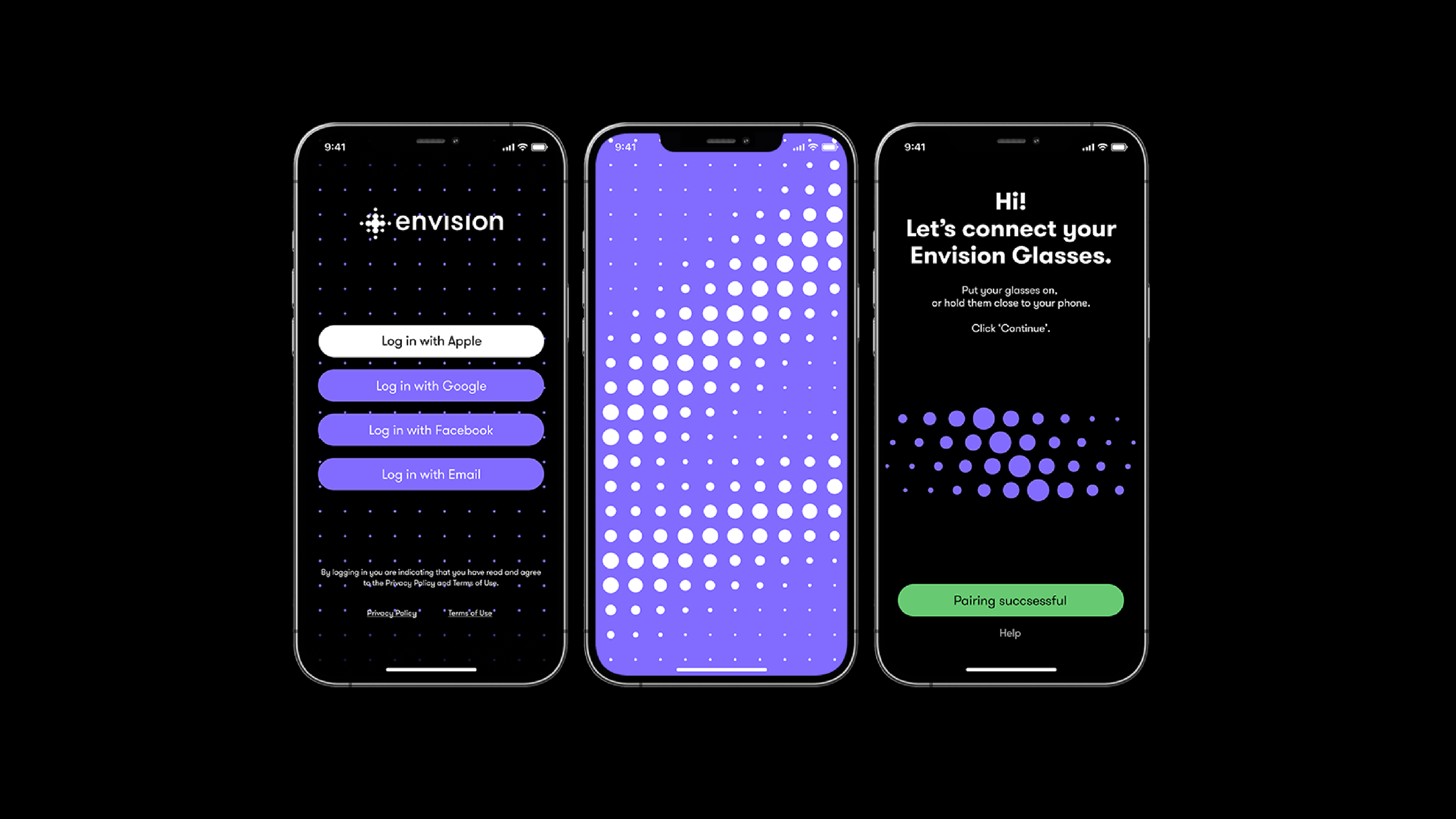
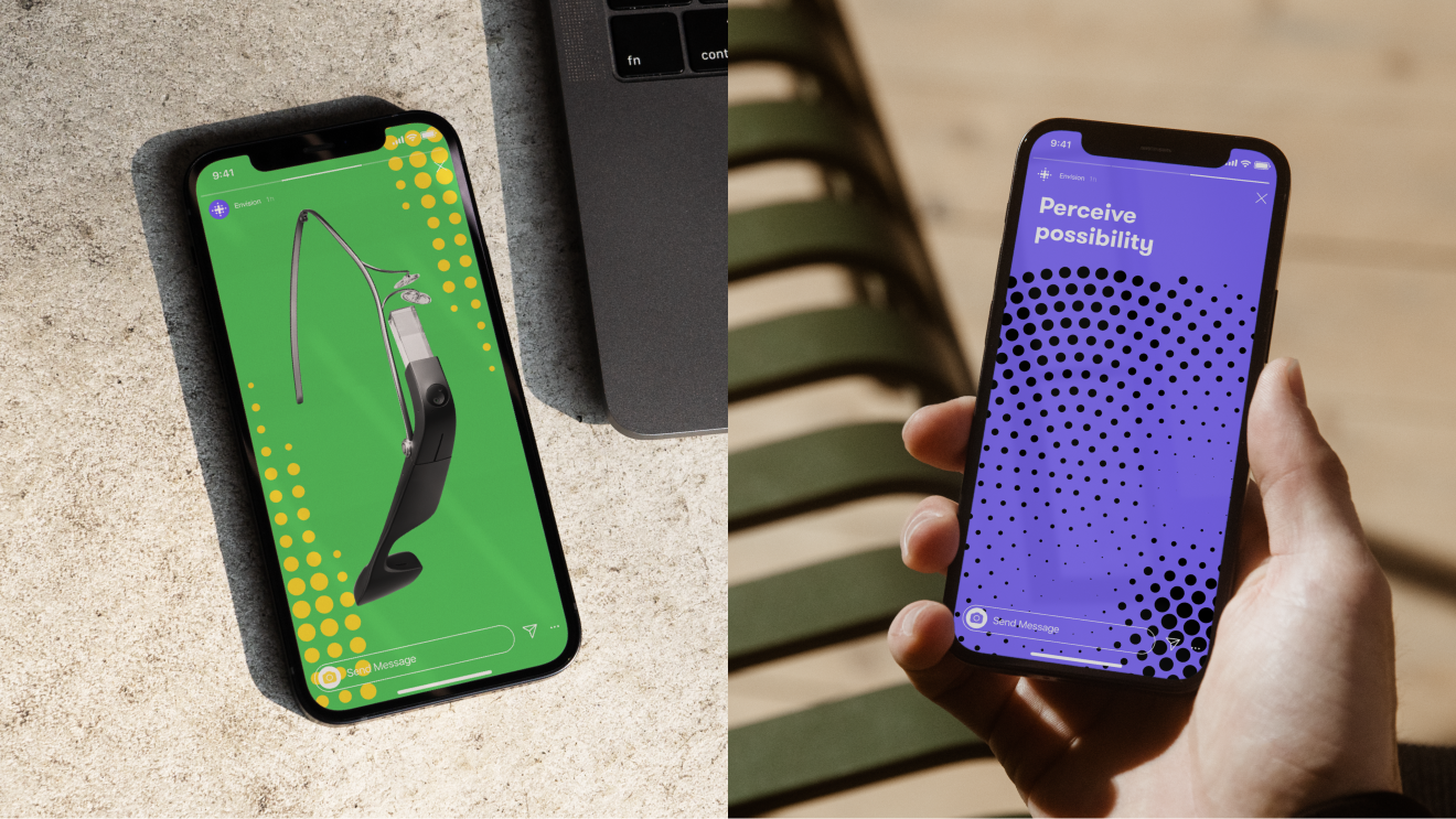
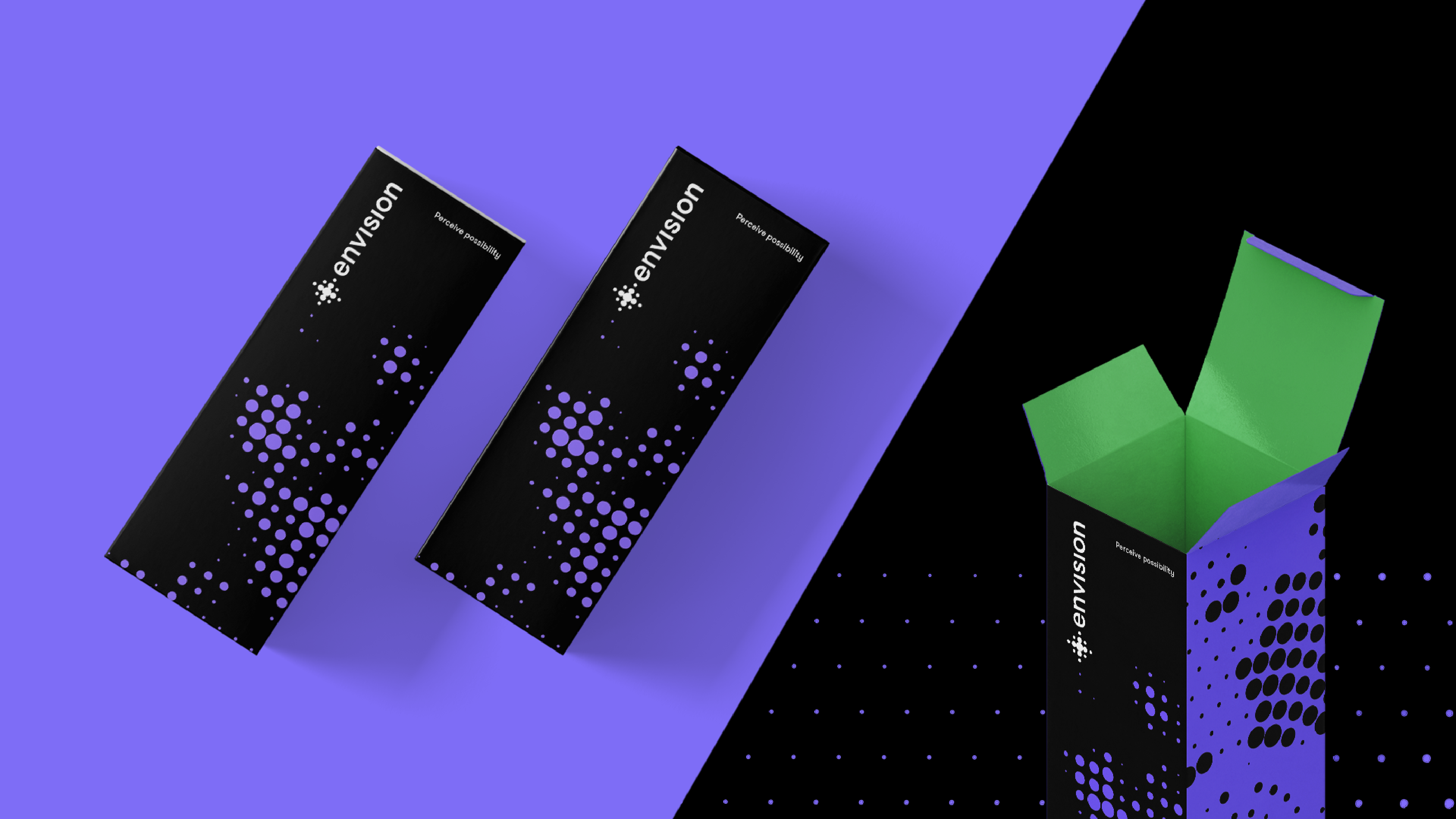
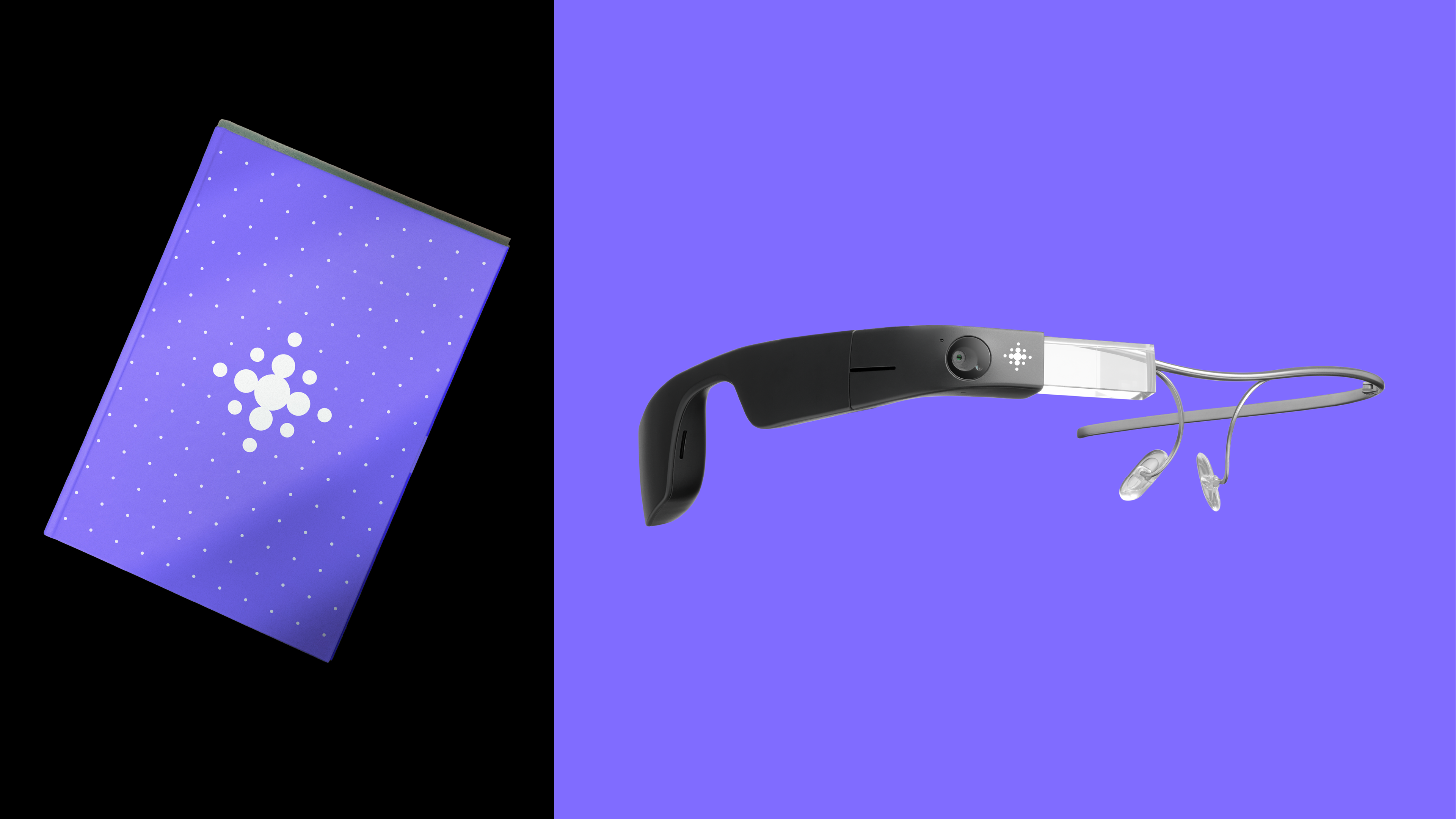
The new icon alludes to the technological capabilities of Envision. With dots that lead and expand into a centralized point, this icon represents bringing clarity and focus to the senses of the visually impaired. Copy and tone of voice were crafted not only to be read but mostly to be heard. Colors were carefully chosen and paired to have the highest contrast. Typography to be legible in all situations. The result is an expressive and accessible identity made with intent. All to be there when someone wanted to experience it for themselves, independently, with their own eyes.
The icing on the cake was the legend Stevie Wonder himself becoming an Envision Glasses enthusiast in March this year.
Designed at DC Amsterdam