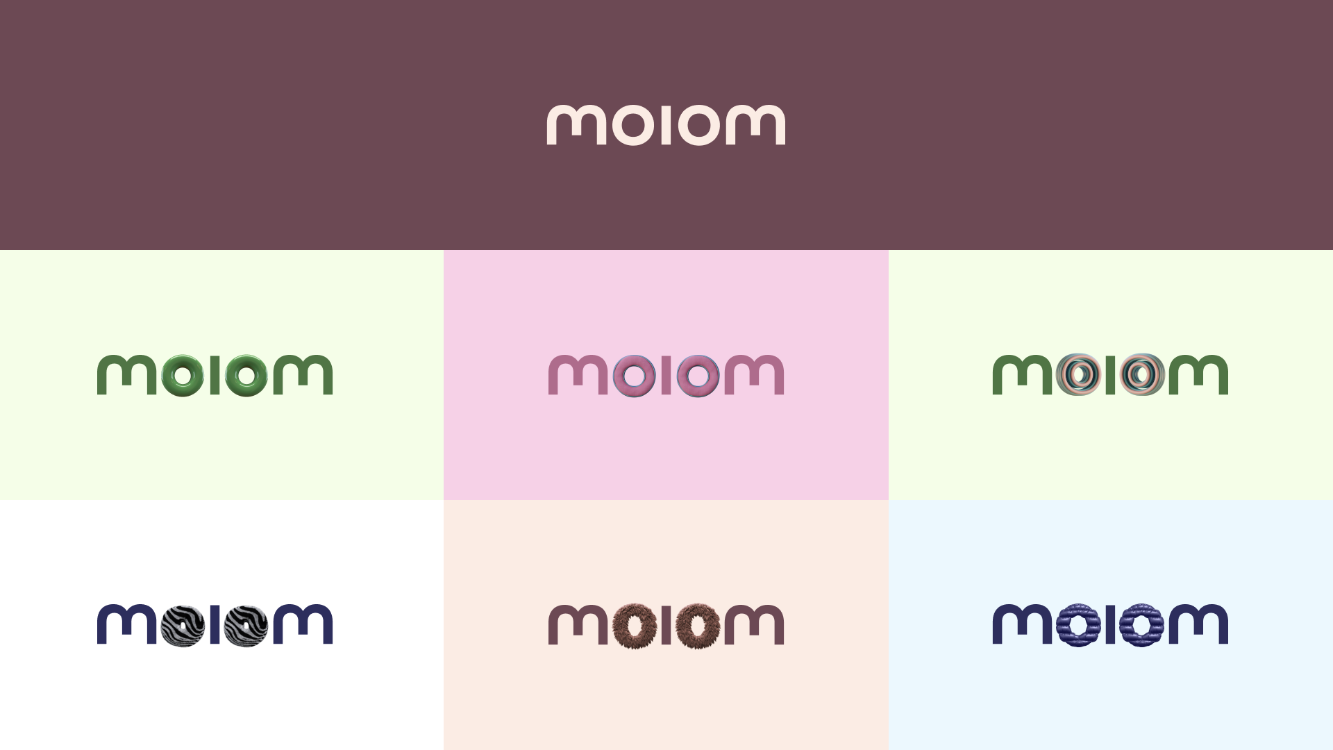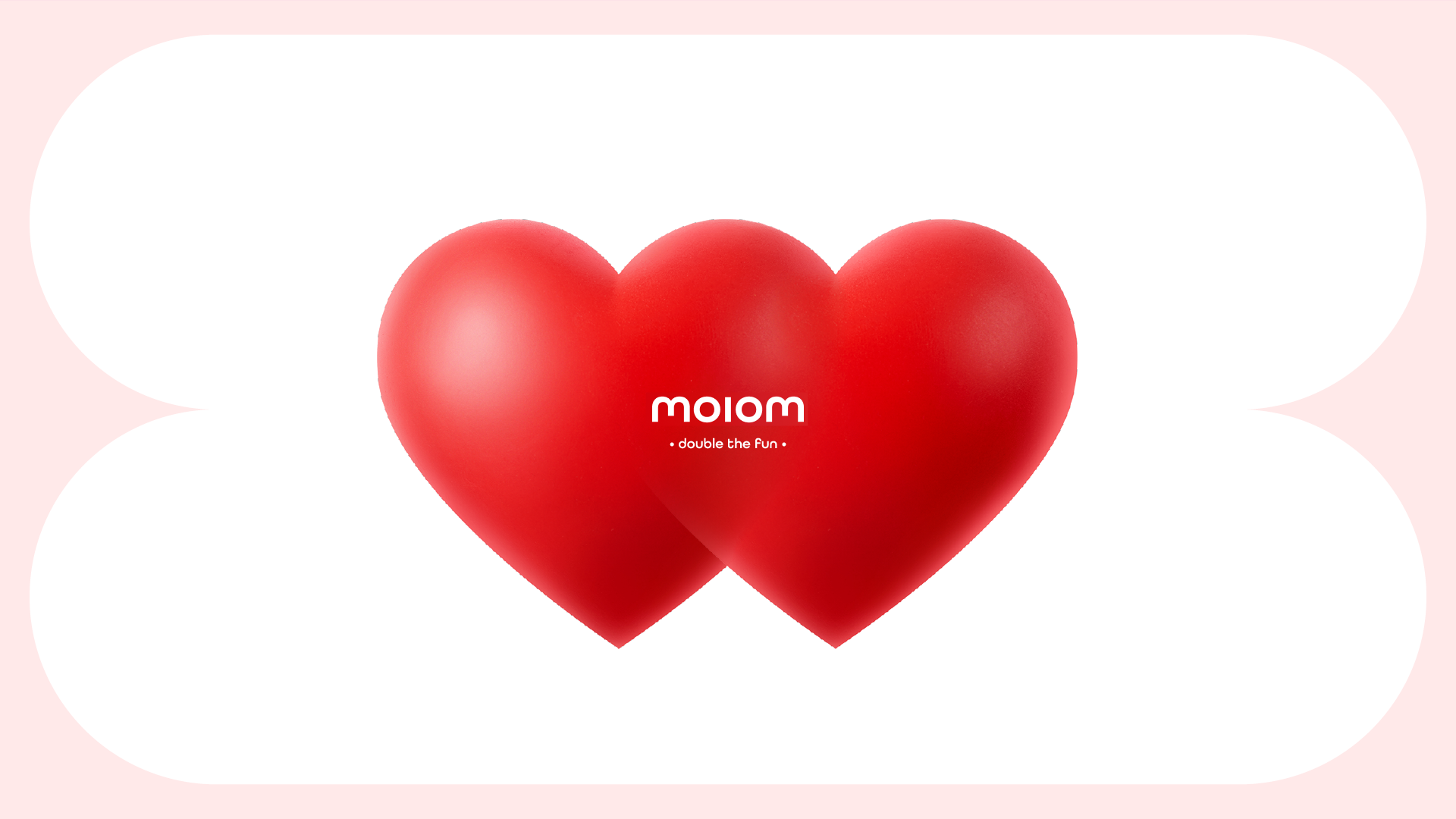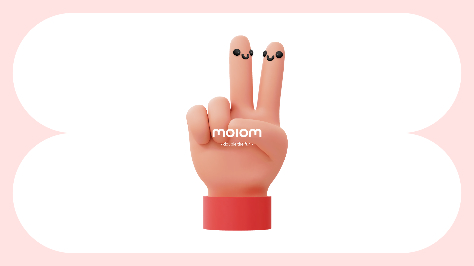
moiom
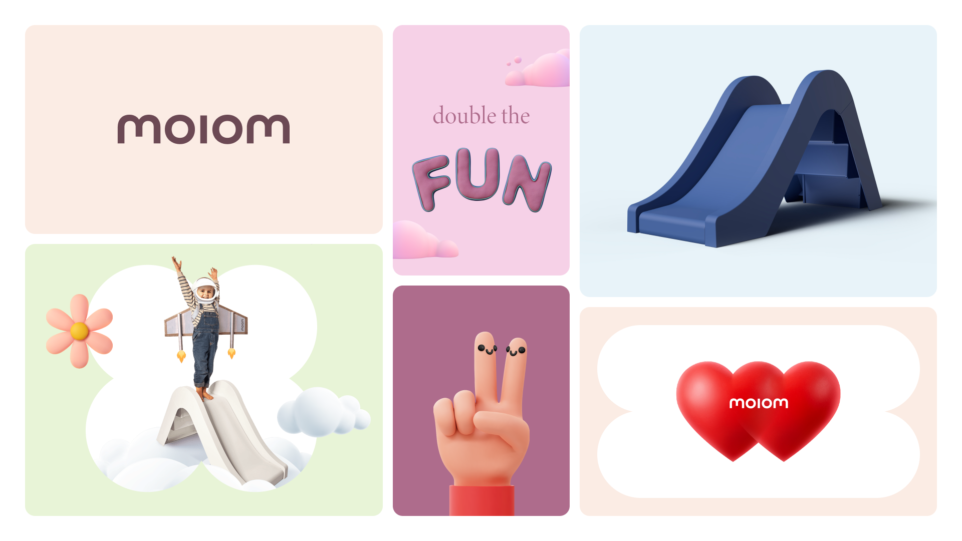
Double the Fun
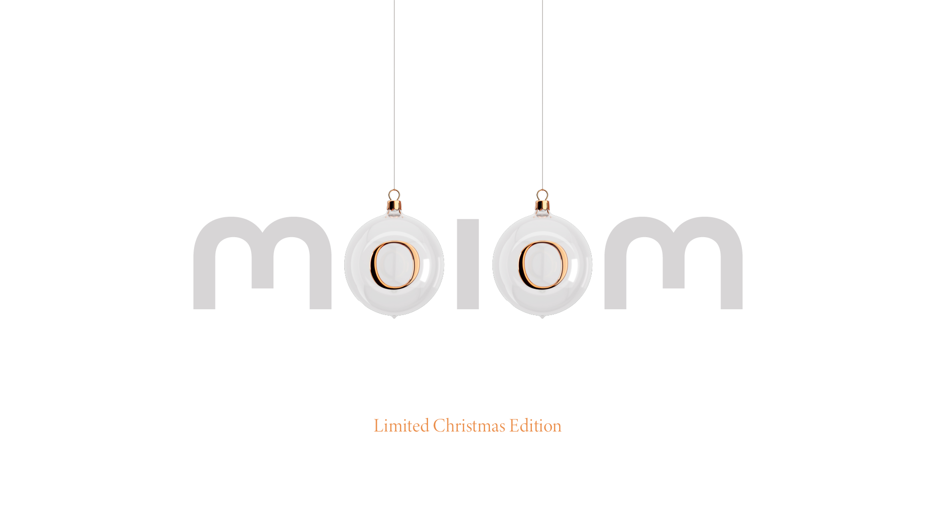
Shared happiness starts with the name. The ear-catching palindrome embodies connection, with the two parts coming together in the middle and the two ‘O’s adopting the shapes of fun objects from LEGO pieces to doughnuts.
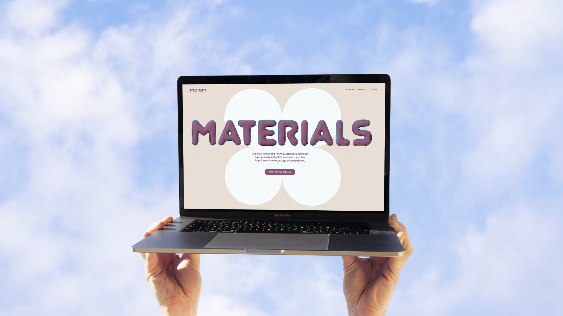
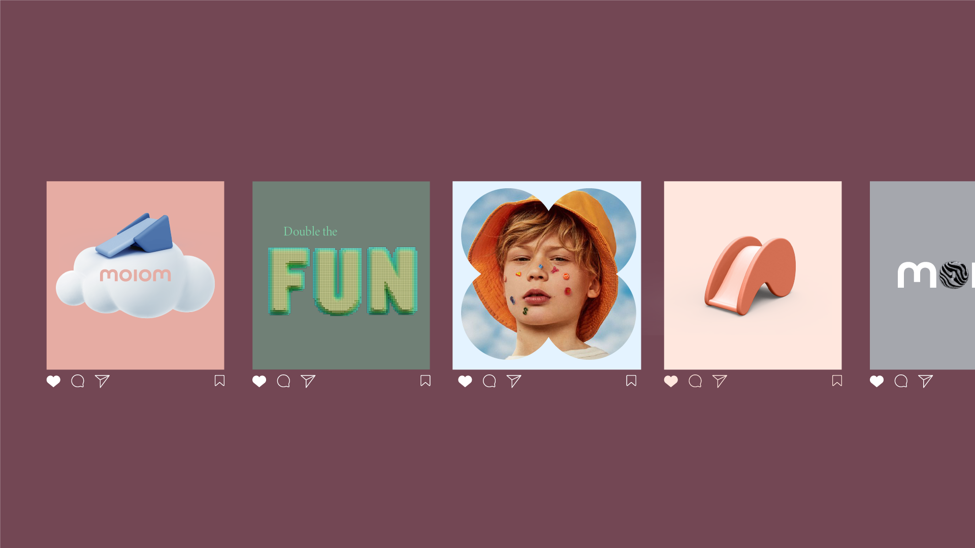
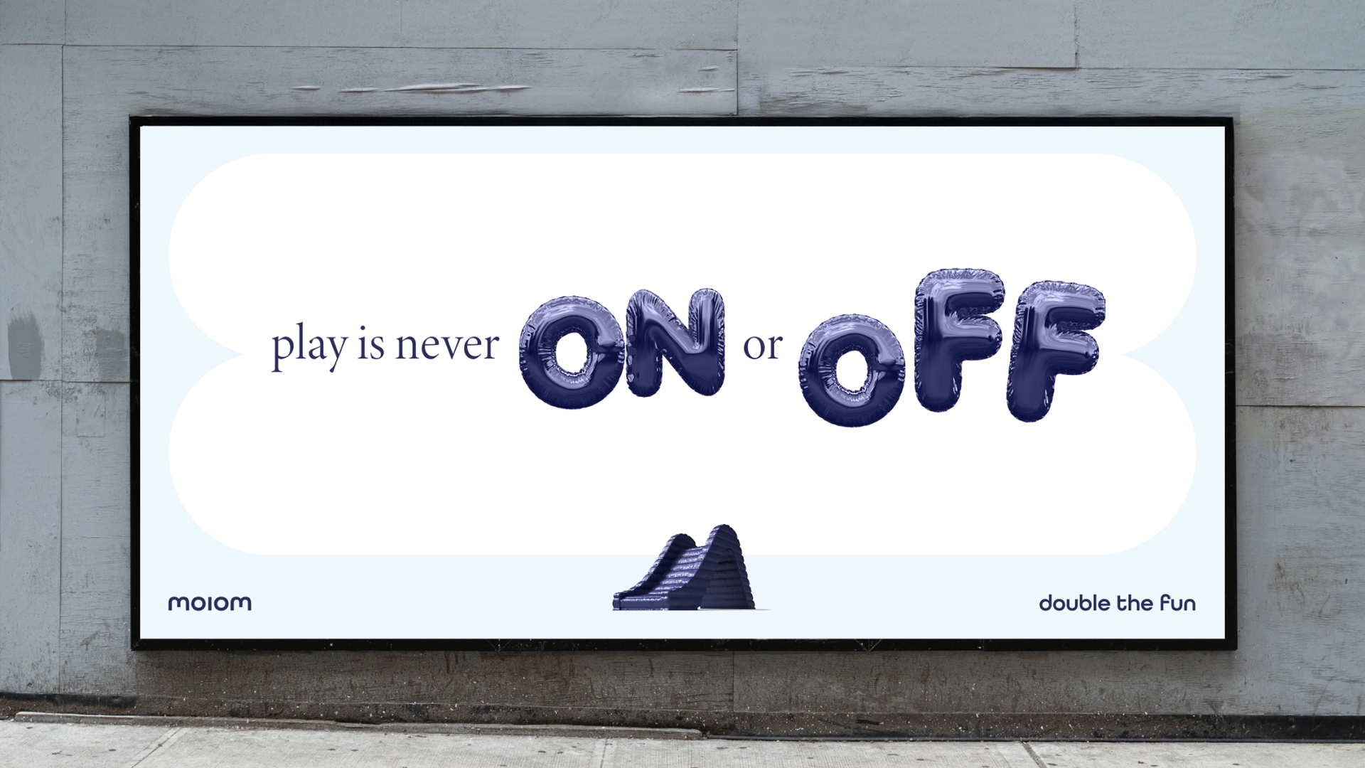
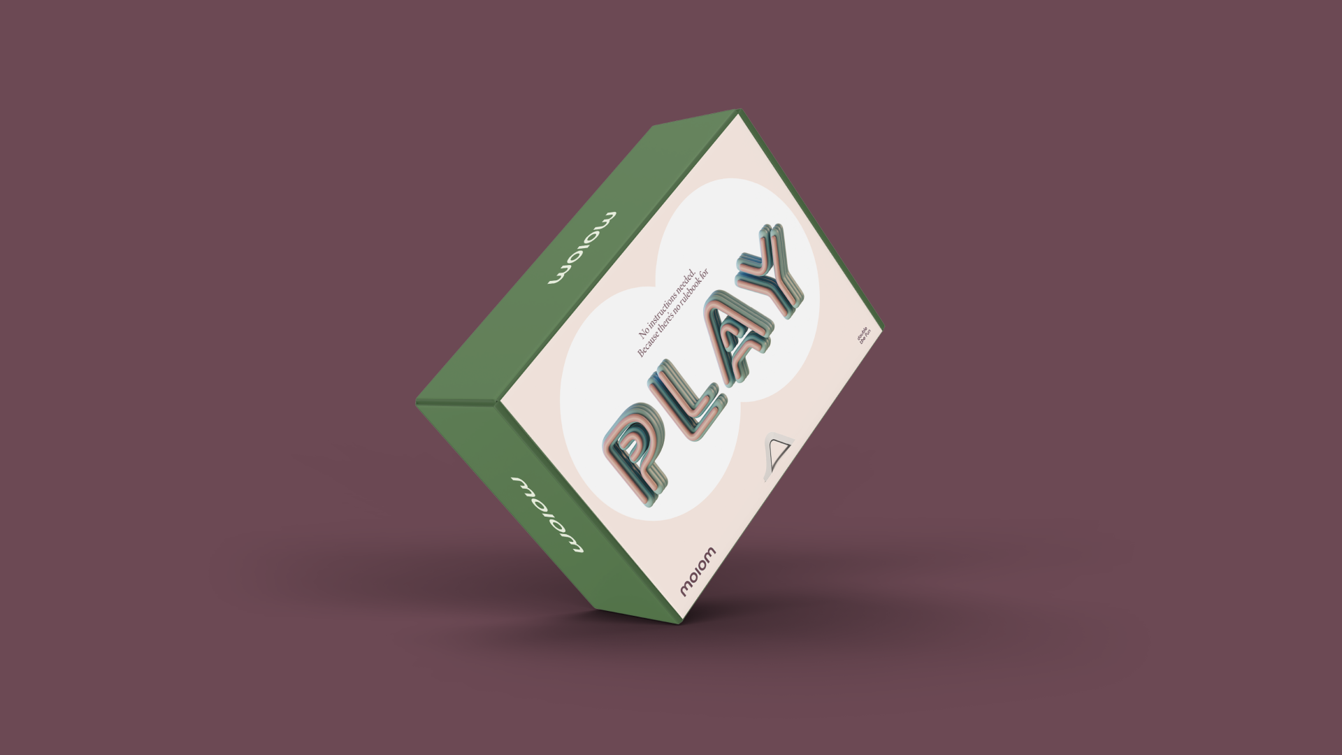
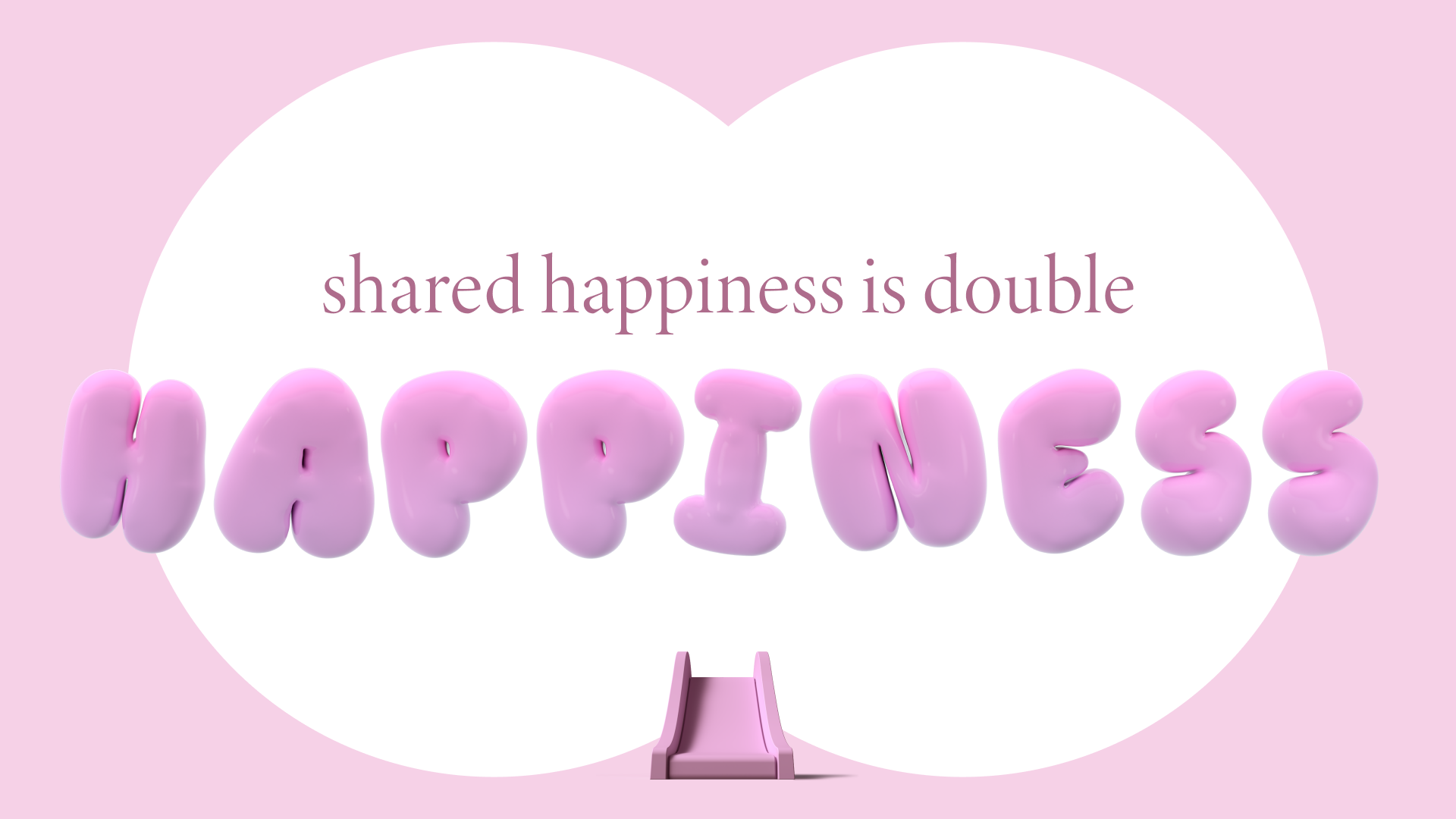
This ethos guides the brand’s joyful and tactile visual identity, anchored by the concept of multiplying. From the symmetrical shapes, squishy 3D renders, and a balloon-esque typeface to the vibrant photography and harmonious colour palette, moiom is playful yet premium, lively yet refined.
Play is infused in the brand’s tone of voice. No baby talk, boring grown-up talk, or being loud; Moiom ignites your imagination and inspires you to start playing.