Mepal
GIVING THE DUTCH STAPLE A FRESH LOOK
For 75+ years, Mepal has been a household name in the Netherlands. From lunch boxes to
food containers, every Dutch home probably has a Mepal product, whether they realize it or
not. As Mepal expands into new categories and markets, how can the brand stand out from
the crowd while staying cohesive?
CREATE A SIMPLER EVERYDAY FOR ALL
For 75+ years, Mepal has been a household name in the Netherlands. From lunch boxes to
food containers, every Dutch home probably has a Mepal product, whether they realize it or
not. As Mepal expands into new categories and markets, how can the brand stand out from
the crowd while staying cohesive?
JOY IN SIMPLICITY
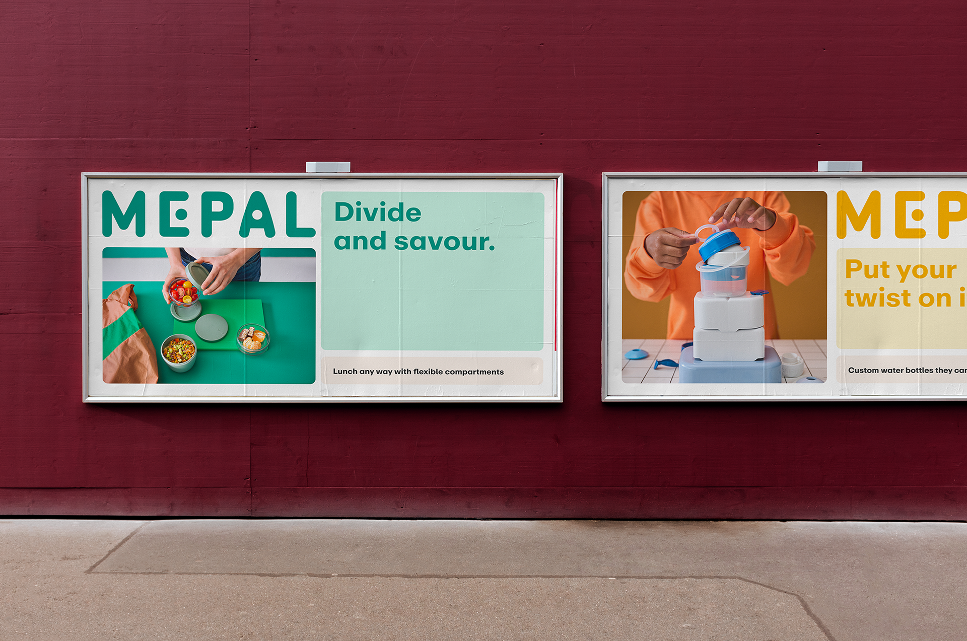
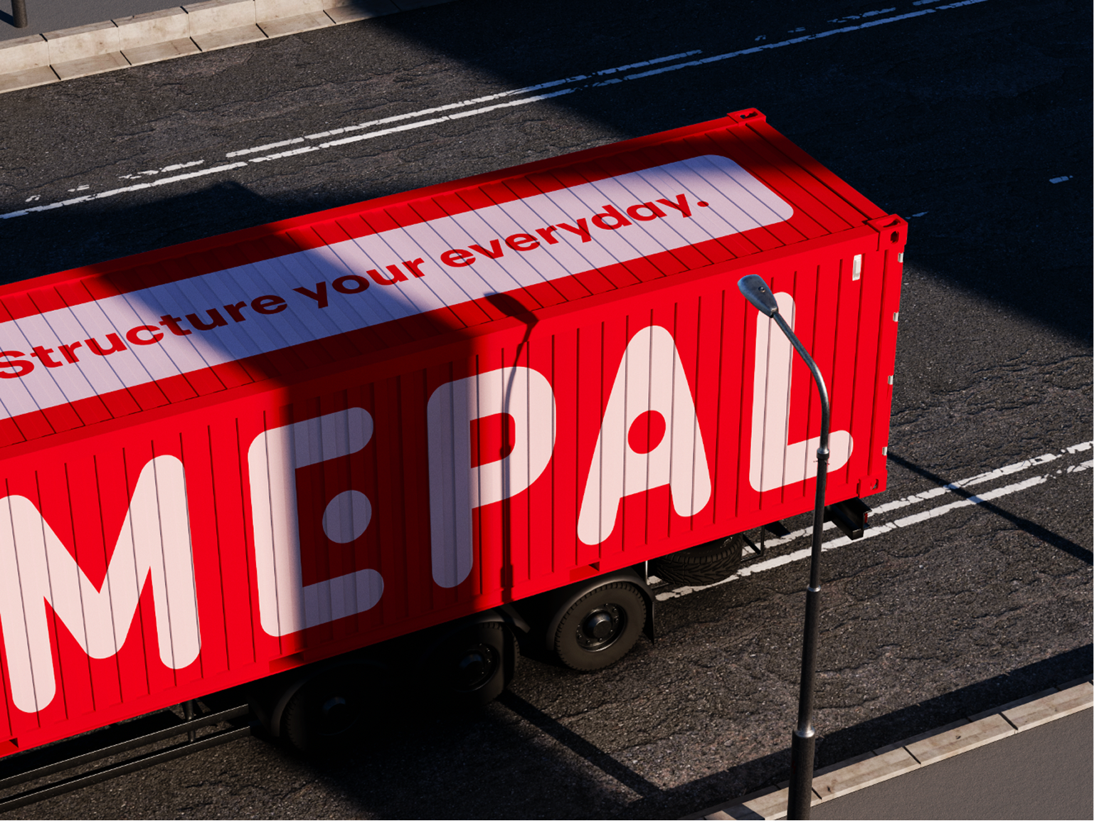
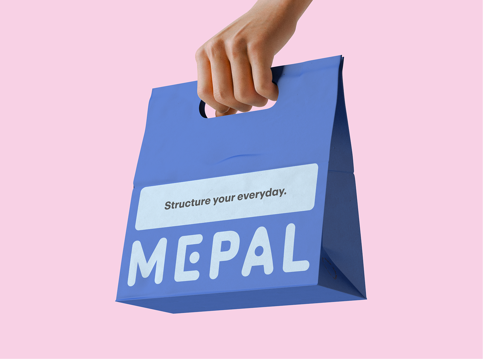
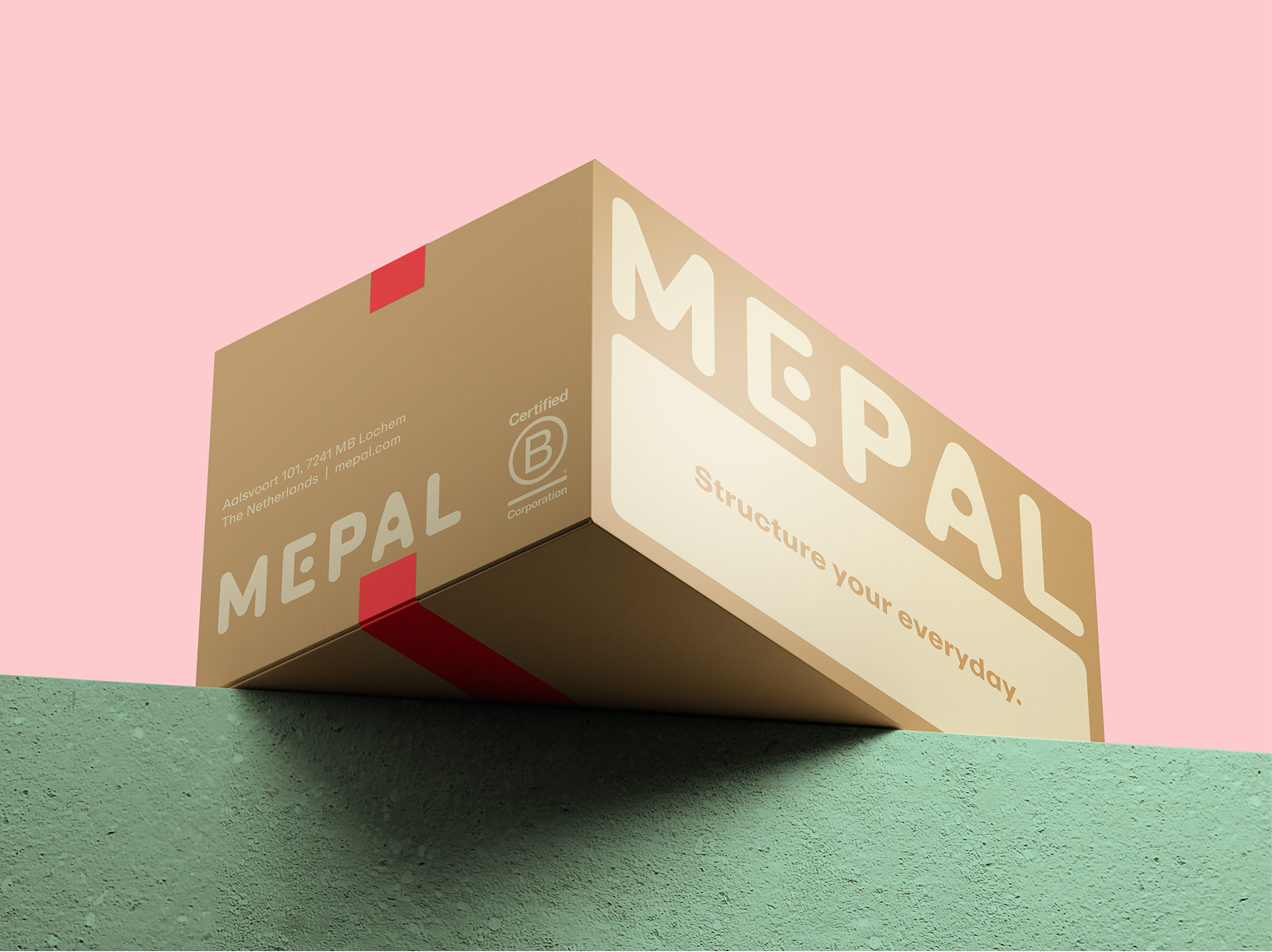
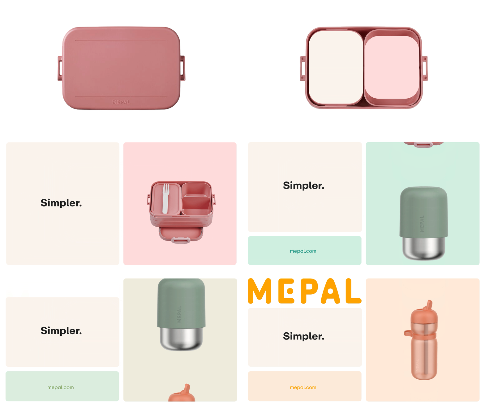
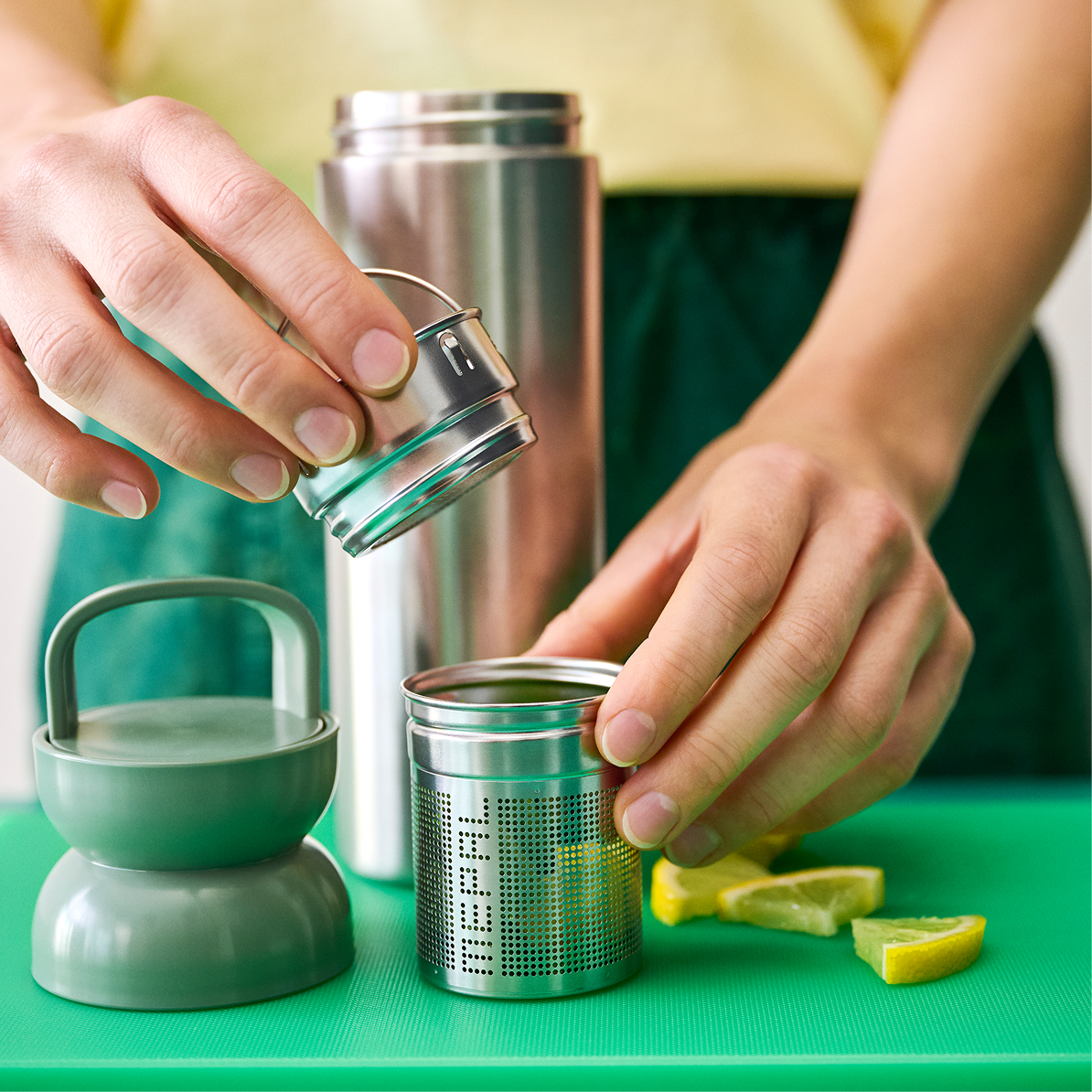
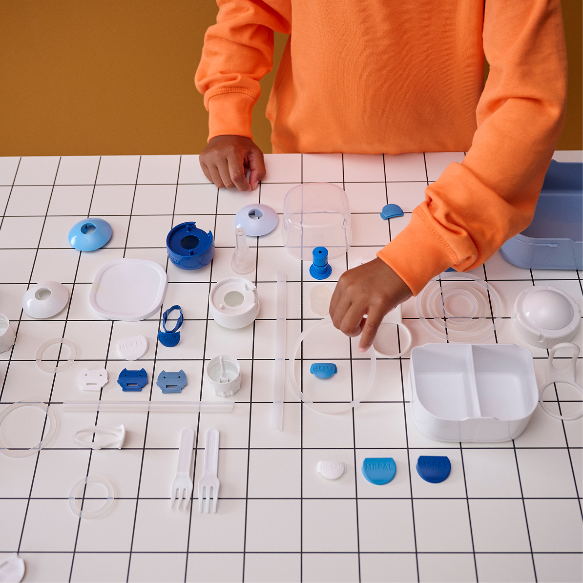
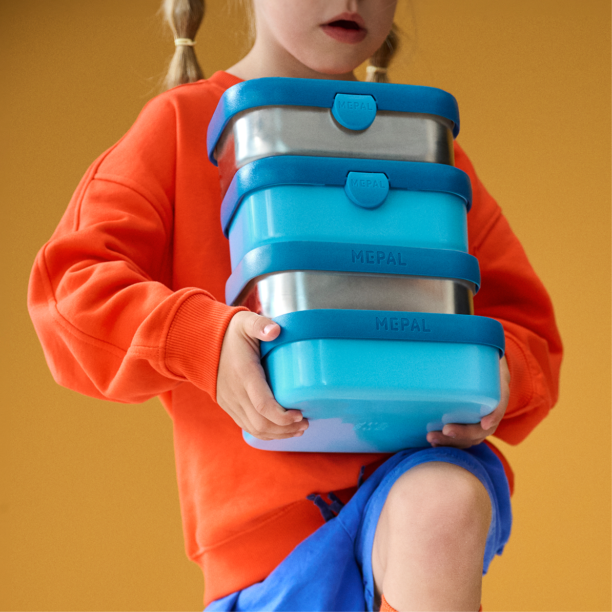
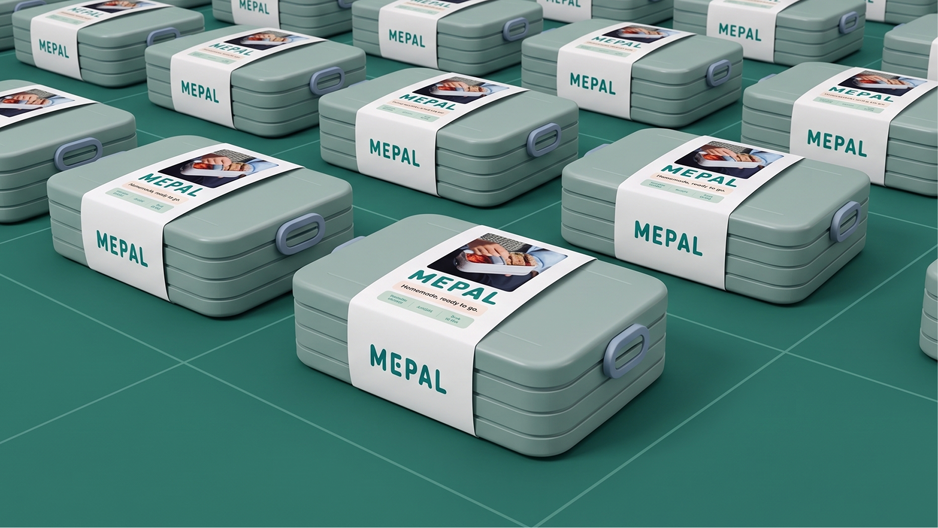
With Simpler as the starting point and inspiration, we crafted a cohesive, minimalist visual
identity. Its stacked, modular graphical system serves as a blank canvas for other brand
elements, providing structure, clarity, and flexibility while also nodding to its organizational
products.
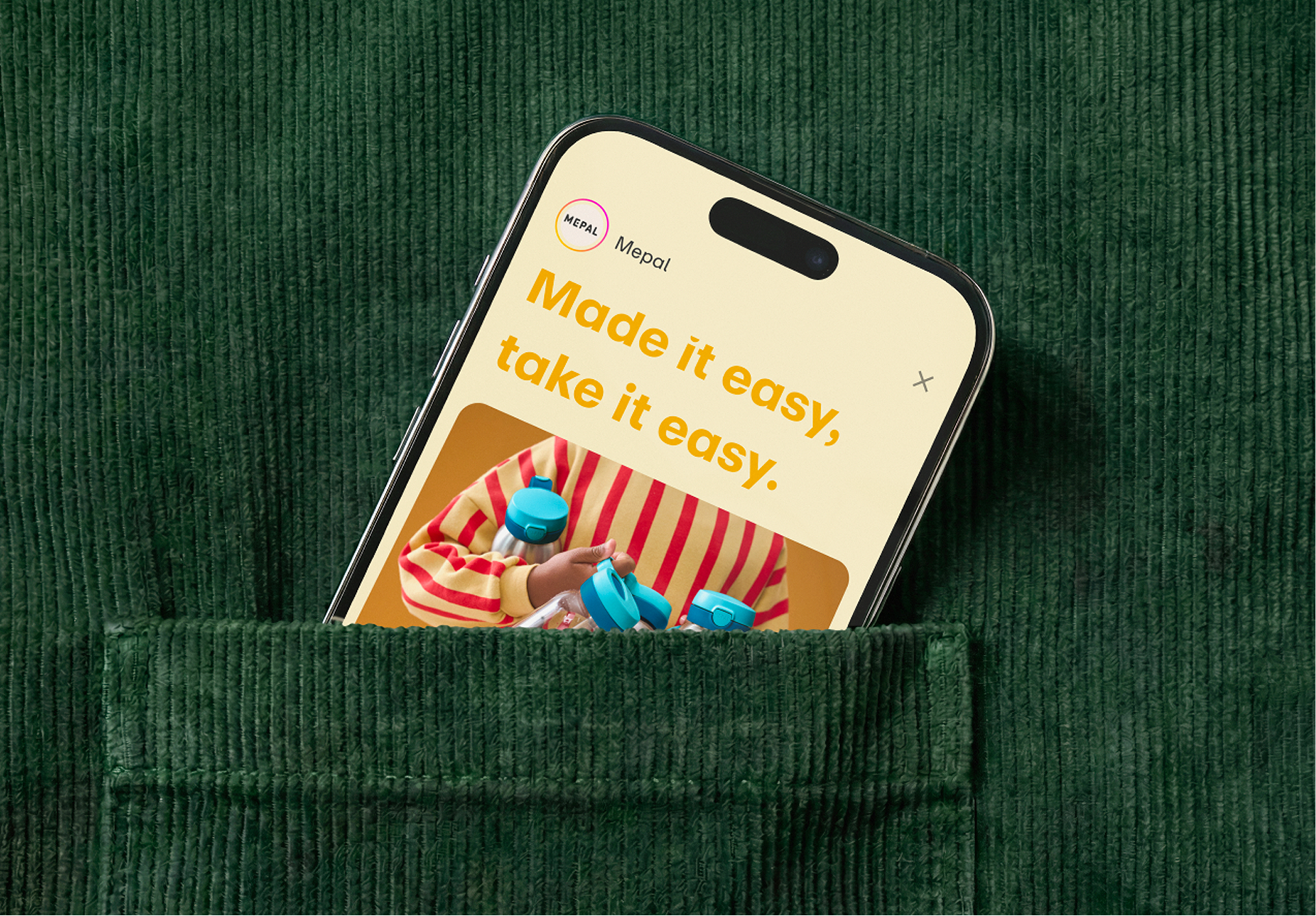
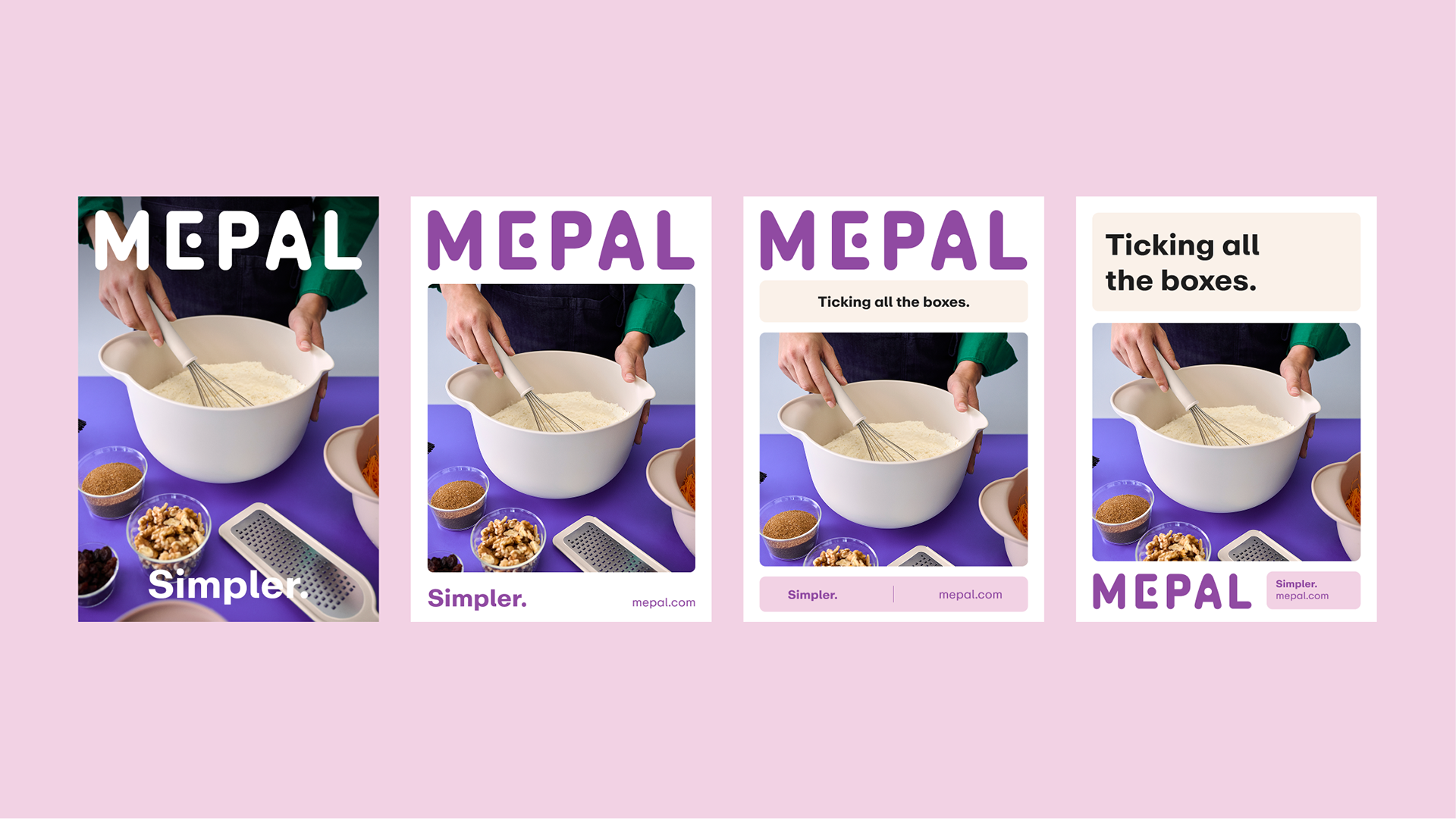
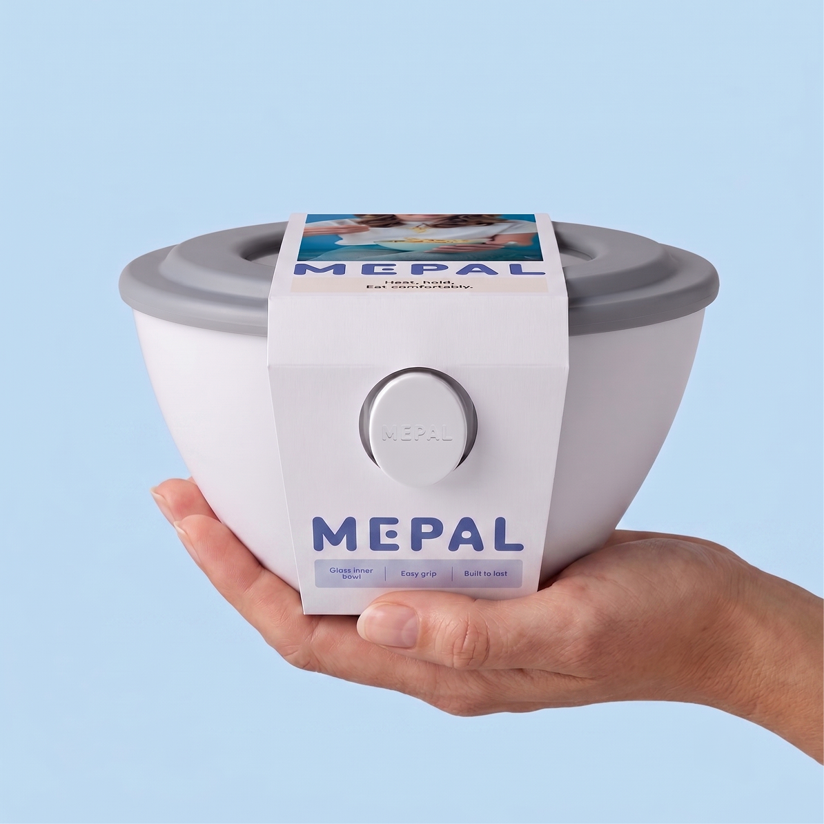

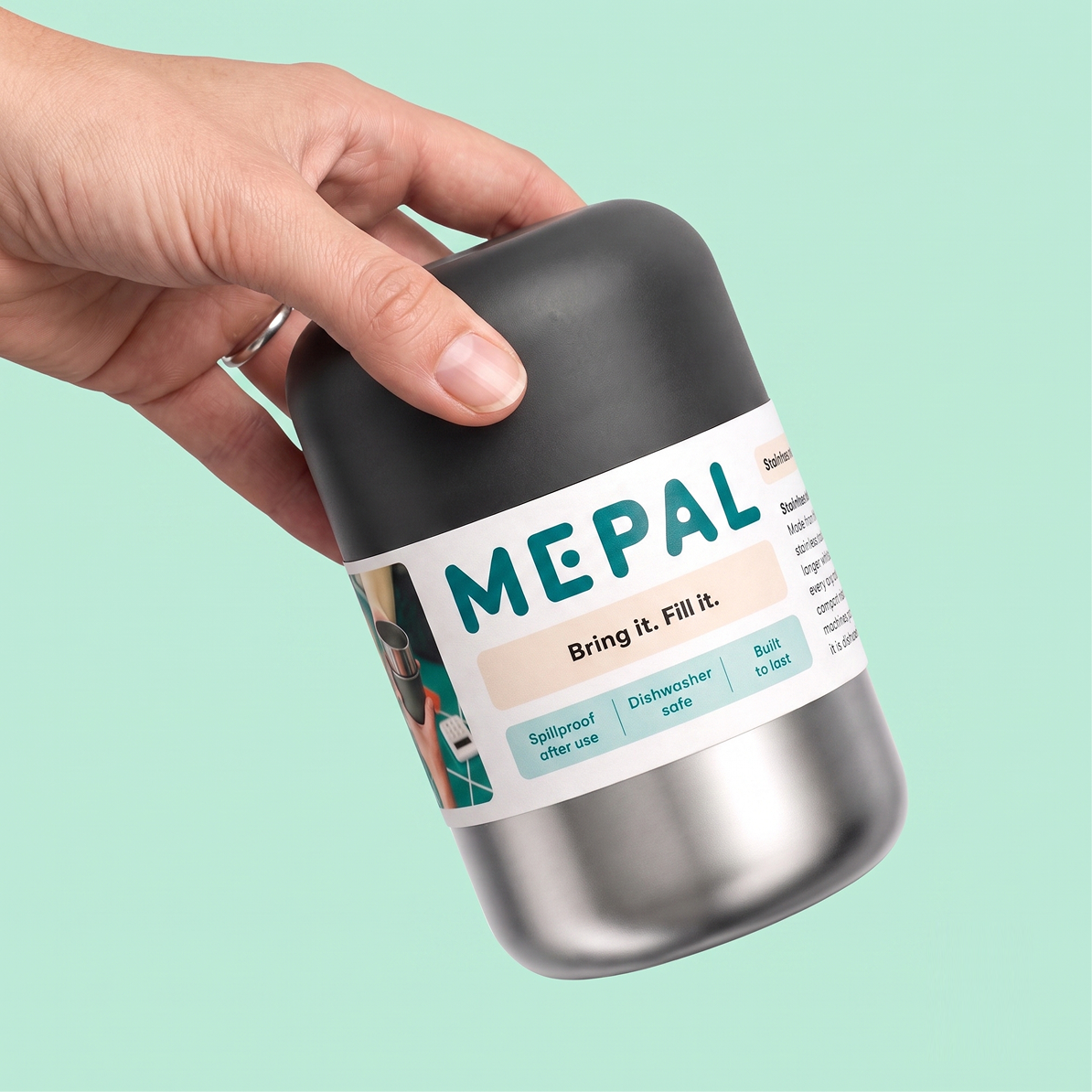
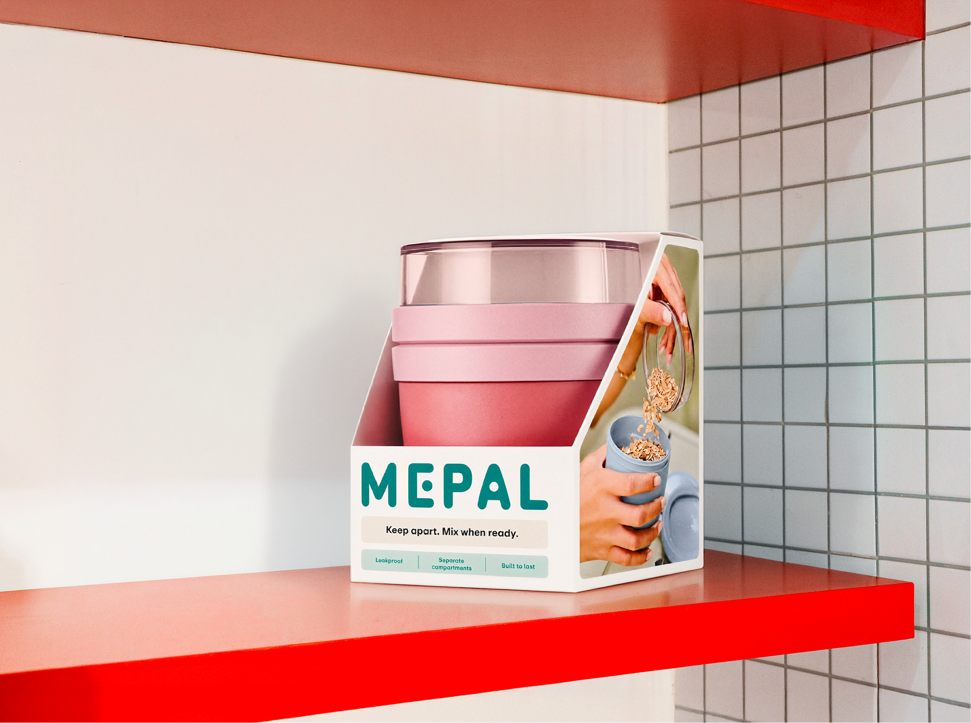
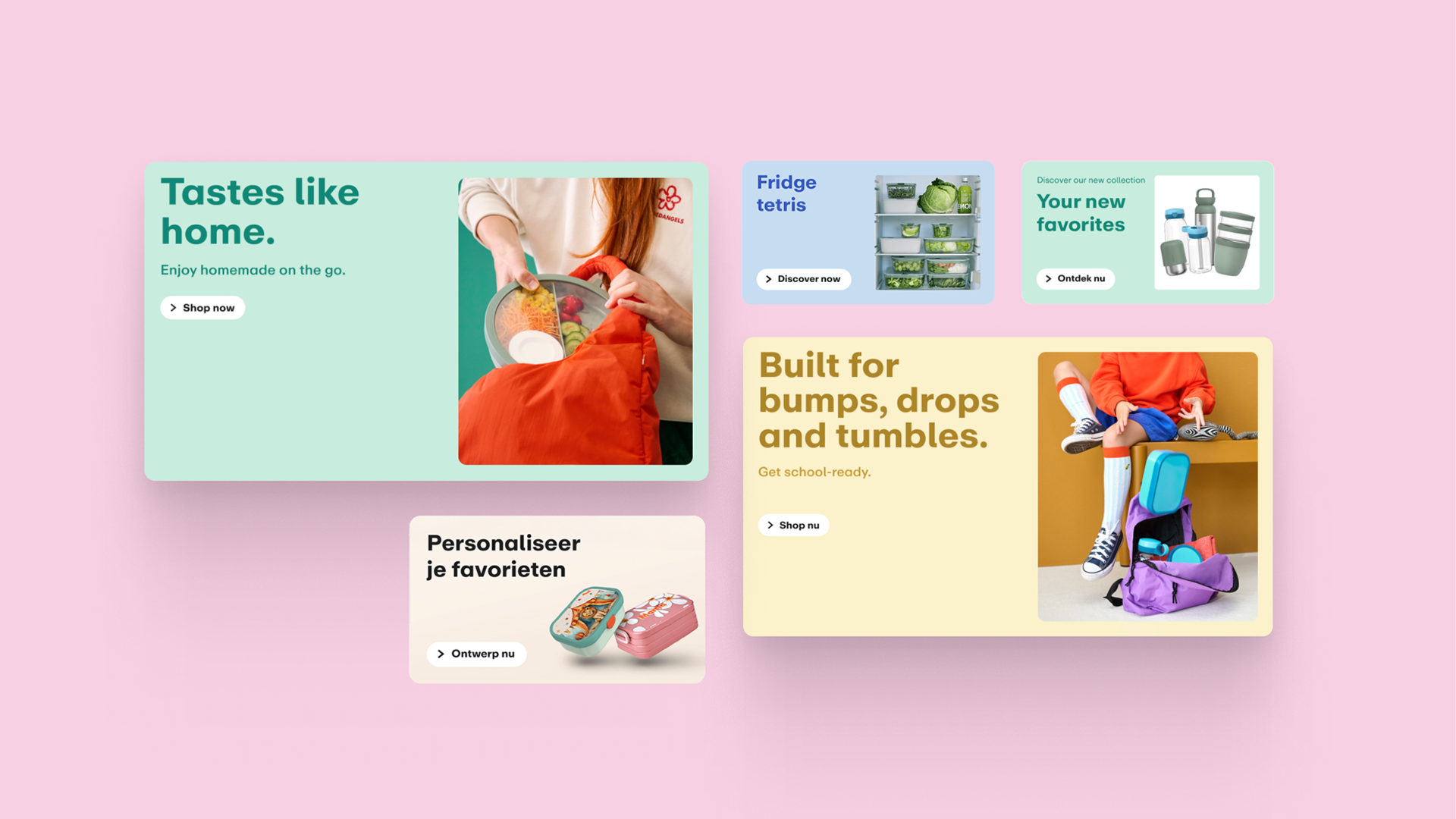
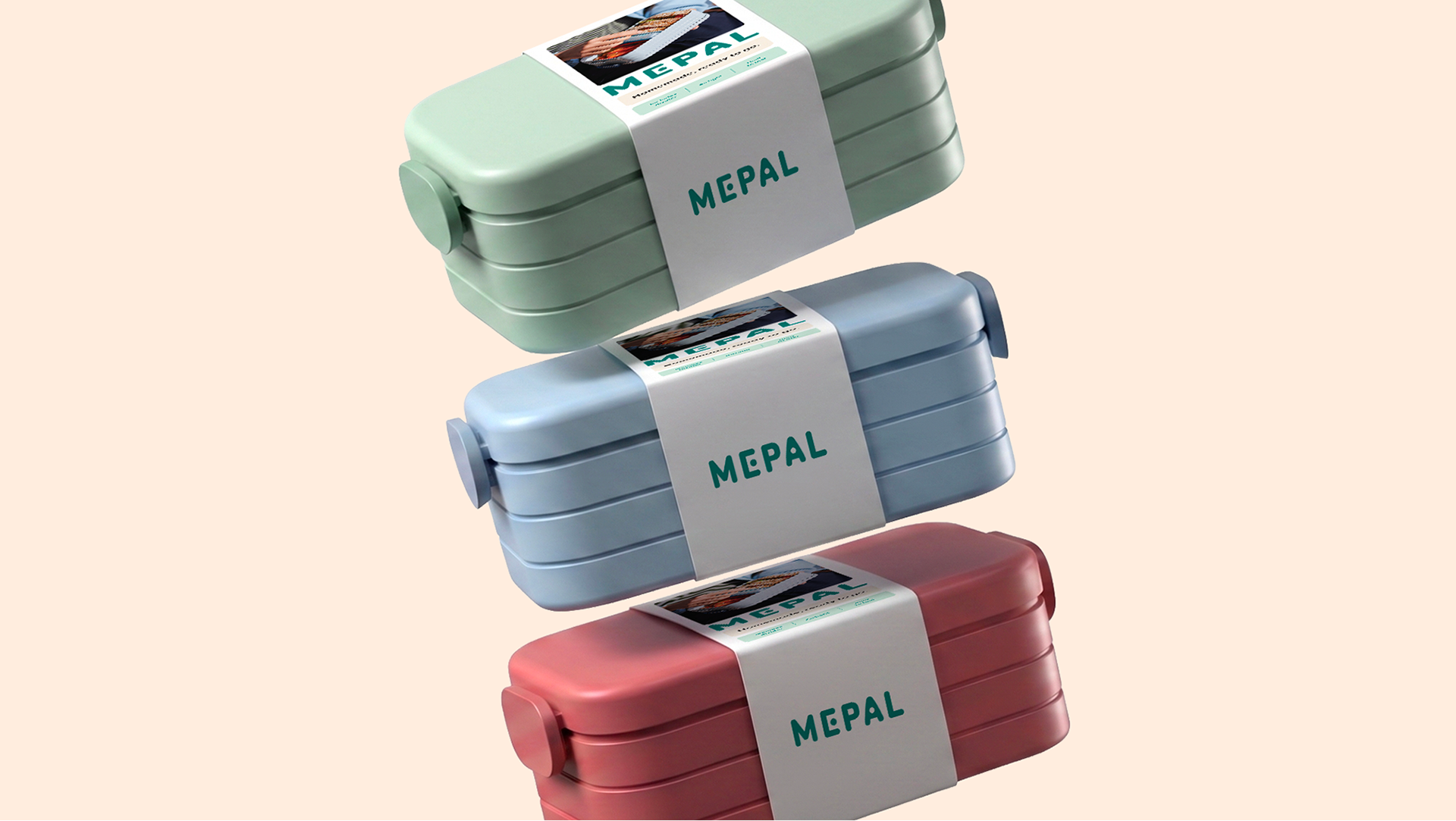
With a wide range of colorful products, Mepal’s palette must remain consistent and
distinctive, especially in packaging. Using colors as classifiers, we help each product
category stand out while keeping it unified and harmonious on the shelf with secondary
shades.
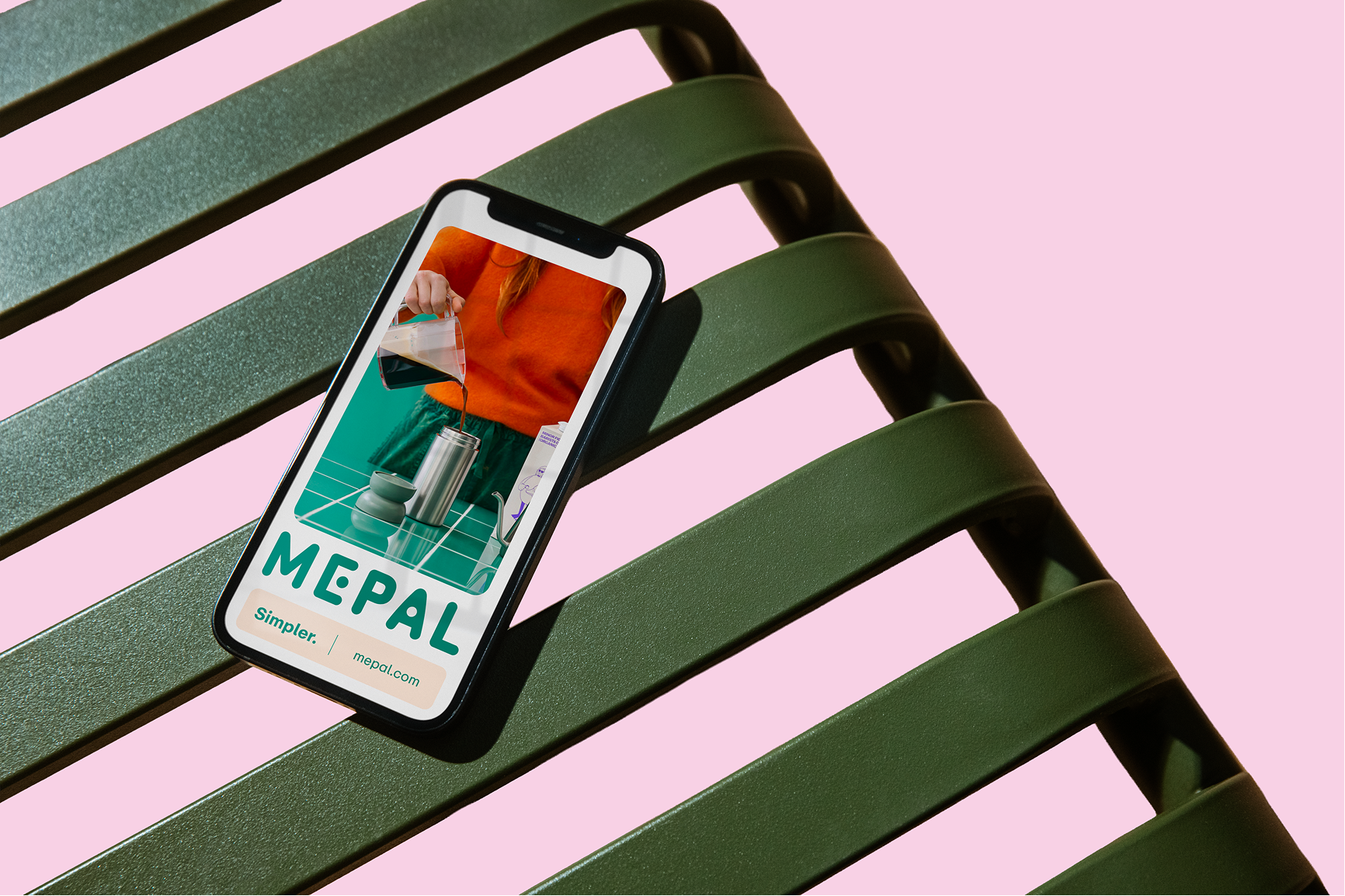
“Simpler” echoes in the brand’s tone. Mepal speaks optimistically and practically, always
with a fun twist. Finding refreshing and relatable angles in every message, the brand is direct
but never plain.