Peaks
In the world of investing every other company claims to be the easier, smartest and cheapest way to grow and manage your money. And so did Peaks, very successfully. But to be able to keep its strong position and align with the brand's new aspirations for higher and more experienced investors; an evolution was needed.
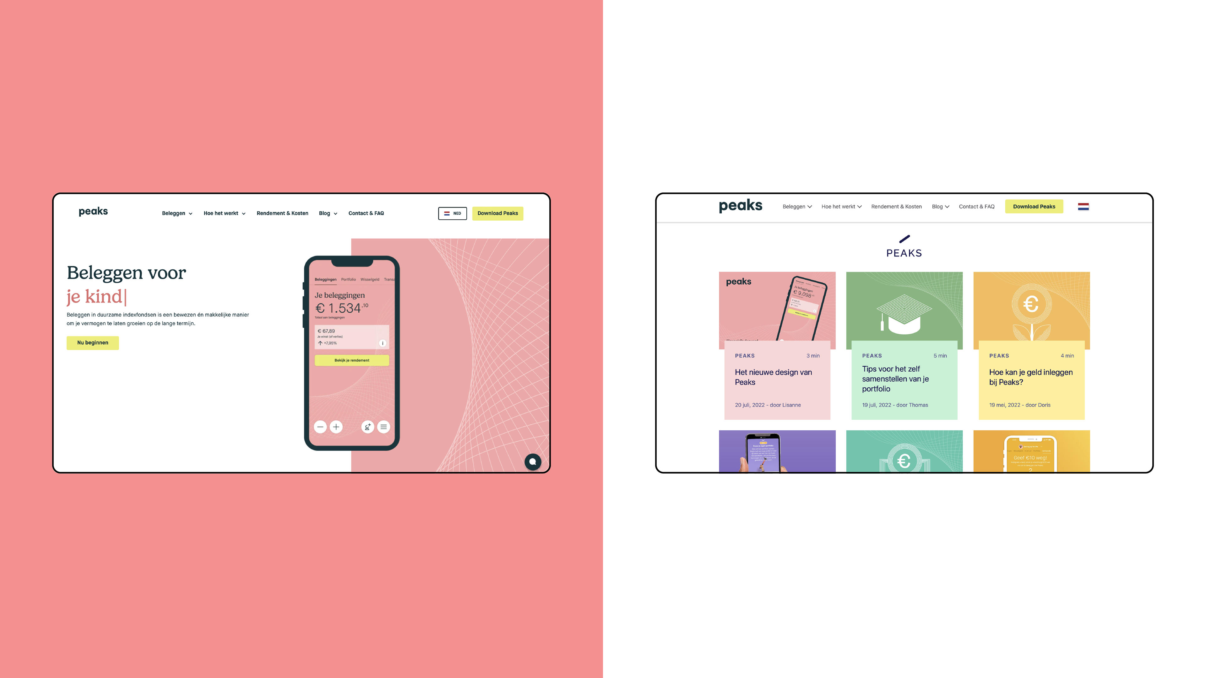
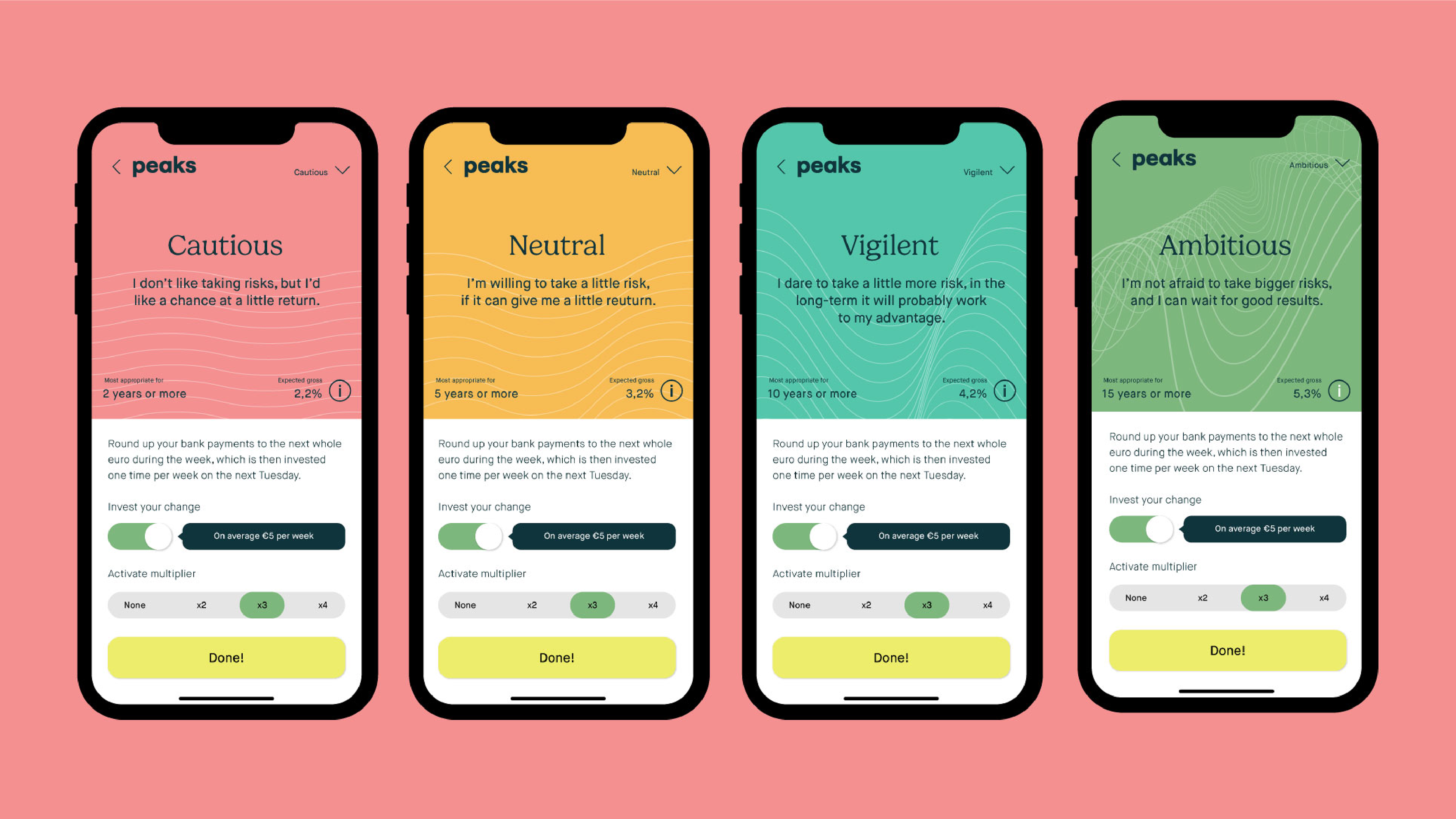
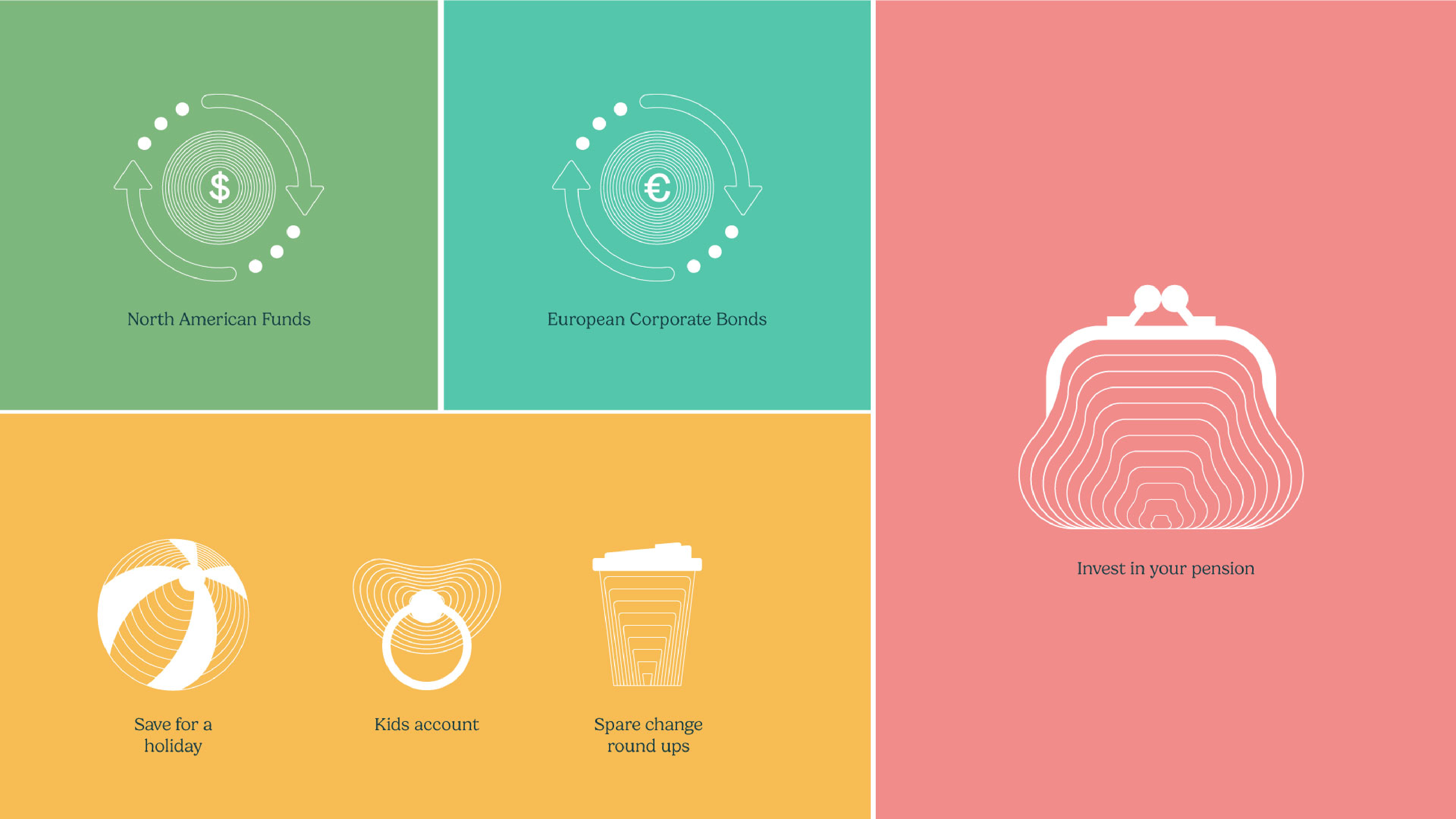
Peaks was originally positioned towards low-barrier, small investments, but is aspiring to grow the brand to a more seasoned investor audience. Therefore our task became to build upon the strengths of the current brand while growing the appeal to potential new clients.
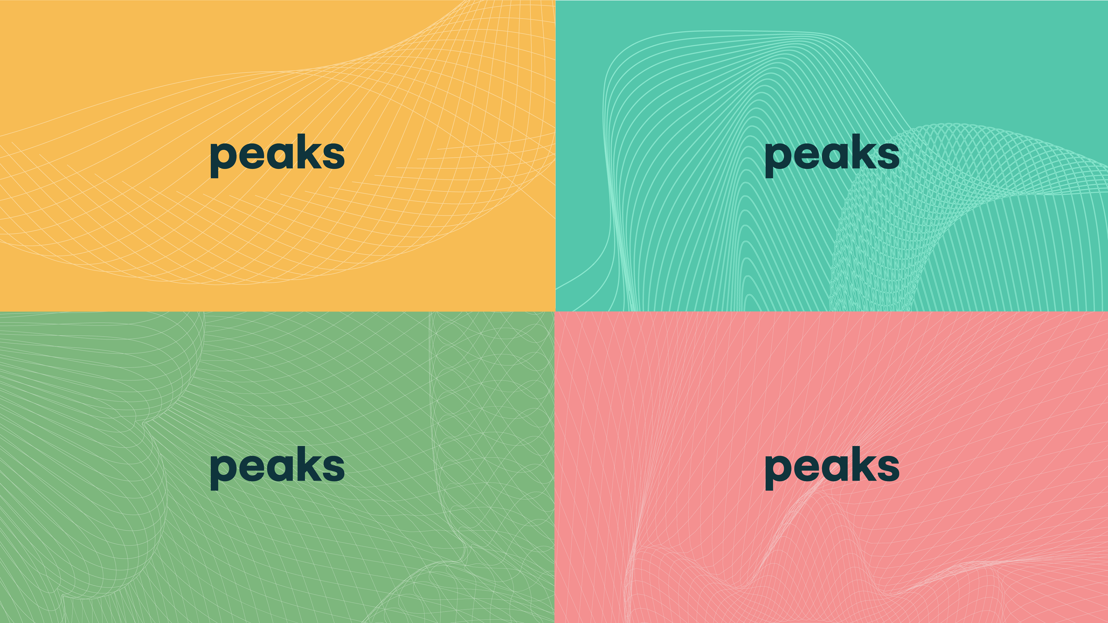
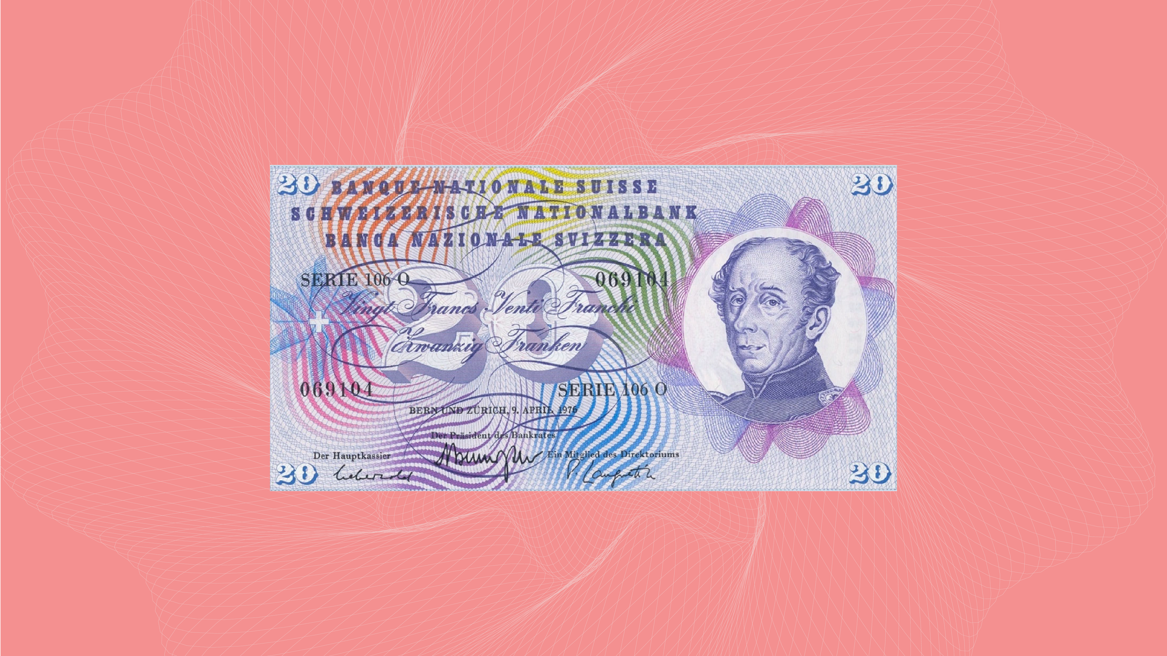
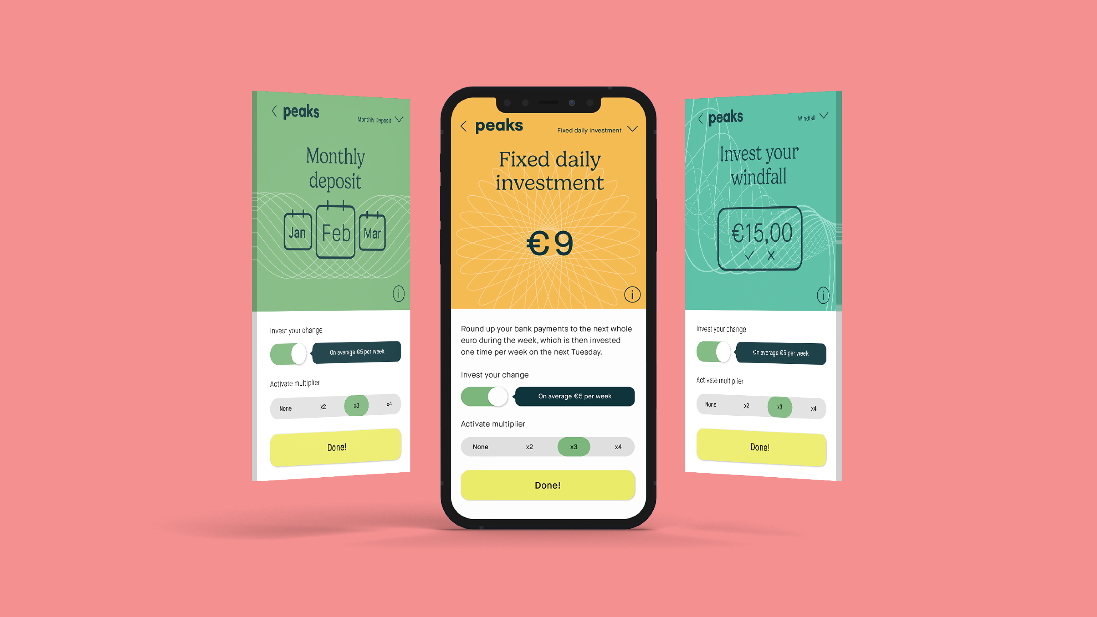
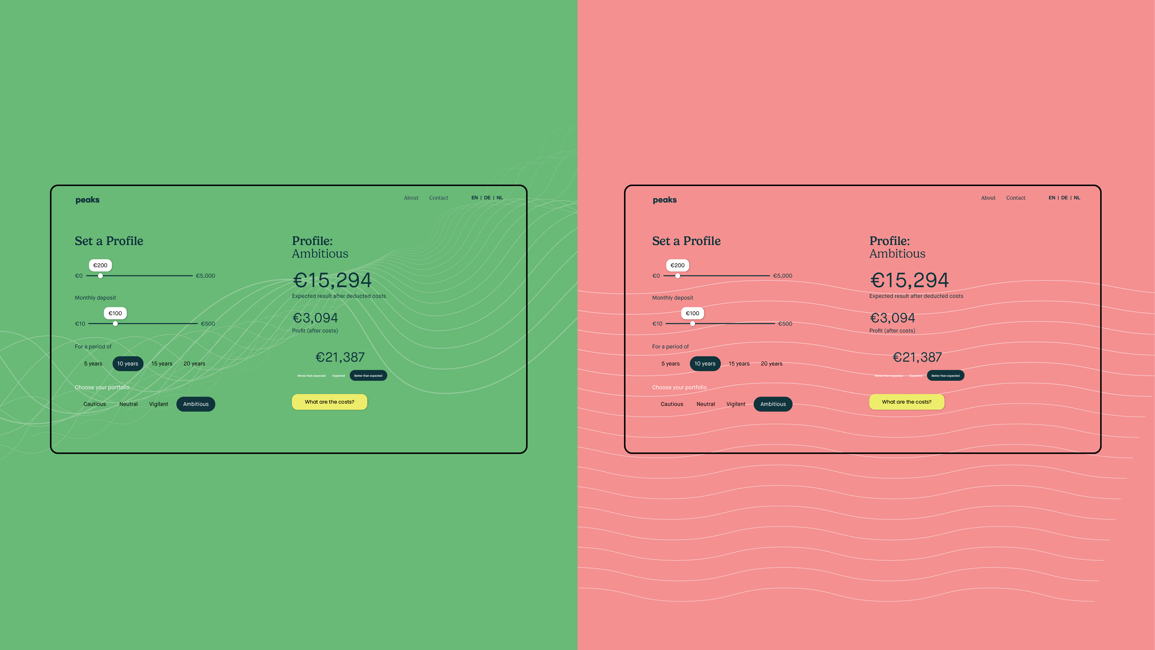
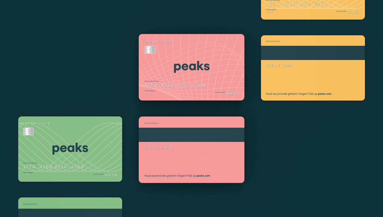
A key part to symbolize this transition can be seen in the pattern which takes inspiration from bank notes and currency design. Because Peak's old identity took inspiration from a ‘piekenpijp’ or piggybank meant for keeping track of coins, a shift to bank notes felt not only like a functional move but also an emotional one to help reposition the brand.
Organic yet mathematical in nature, this graphic style lifts the Peaks brand into a more mature territory, broadening the target audience and appealing to more advanced investors.


Designed at DC Amsterdam